Shop Suggestions
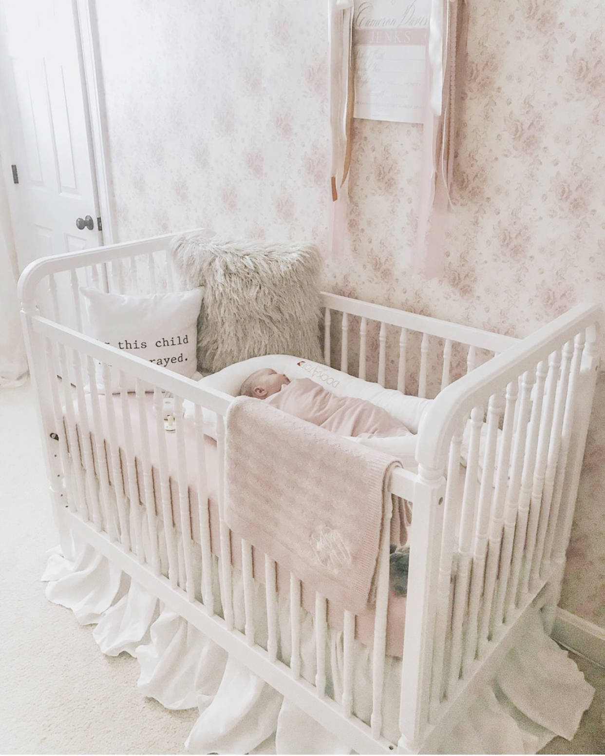
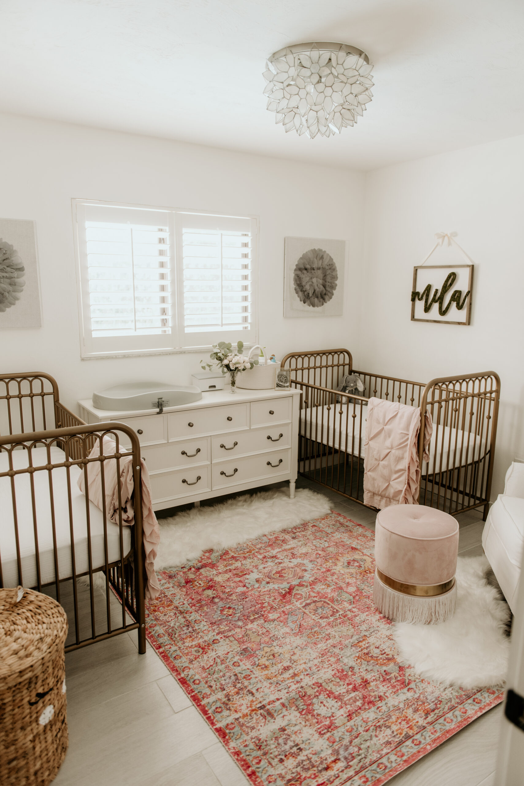
The moment I found out that we were having a baby, I began to envision my dream nursery. Whether we had a boy or a girl, I knew that I wanted a neutral space that would be warm and inviting. Most of all, I wanted our baby’s nursery to be unique. When we learned we were having a girl, I remember thinking I finally had an excuse to install a fun patterned carpet or wallpaper in the house! Heck, I would have made it an excuse with any gender! FYI: I chose to do both!
We designated the smaller of our two guest bedrooms as Charlie’s future nursery and got to brainstorming! I knew I wanted feminine textiles with greige tones and a pop of gold to add warmth. I sat in the floor on countless occasions drawing out varying floor plans and furniture layouts that I thought would work best with the structure of the bedroom and provide for an easy transition from nursery to toddler room. This room has high vaulted ceilings embellished by richly stained wooden beams, so my first thought was to add a chandelier that was large enough for the architectural build, yet still delicate and inviting. In fact, the chandelier was the first item I purchased – shout out to Wisteria!
Cue the carpet craze: I was dead set on a leopard or cheetah print carpet and had quite a bit of convincing to do with Charlie’s Dad! While I wanted a bold print, I still wanted a versatile soft hue. After browsing dozens of animal print swatches, we decided Carpet One’s style “Dosso” was the perfect fit. Not too loud, not too edgy and not too busy. Out of the five color options available for this style, we ultimately chose the most neutral tone: “Shilling.” The soft gray undertones of this color helped create a subtle richness for the entire space without overwhelming the eye. And did I mention it’s the softest carpet I’ve ever laid feet on?!
Designing Charlie’s nursery was not free of difficulties! Charlie’s room had a bit of an odd layout in that there was a single window on the main wall to the far right. Because I wanted her crib to be centered on this wall, that lonely window made for an unfortunate placement. As a solution, we brought in a paned floor mirror from Shades of Light and placed it on the left side of the main wall which, in effect, mirrored the window on the right (pun intended!). Then, we situated a large chest in front of the mirror and window to the left and right of the crib. This allowed us to make the layout of the room appear more symmetrical. We added some gold curtain rods with crystal hardware and hung linen blackout curtains pulled to the side to truly give off the appearance of a second window in the room. As a finishing touch to the main wall, we centered a gold sunburst mirror above her crib. Crystal table lamps from RH Baby & Child adorn the tops of her chests to compliment the crystal finishes in her curtain rods. Speaking of chest tops, if you’re looking for a tabletop monitor for the nursery, I must recommend Project Nursery’s 4.3″ Baby Monitor which syncs with your cell phone through an app via wifi! The sleek neutral white camera blends great with Charlie’s room color palette (and it plays the cutest nursery tunes).
On the opposite side of Charlie’s room we added a comfortable linen Glider, petrified wood stump side table and floor lamp to create a cozy corner for reading books. We placed an oversized antique armoire next to this for housing her growing book collection and threw in some light woven baskets on its shelves to store smaller items such as bows, beanies, slippers, muslin blankets and bibs.
Lastly, since Charlie’s nursery was originally one of our two guest bedrooms, it actually shares a jack and jill bathroom with the other. Since we still needed a designated diaper changing space, we decided to transform this to her own personal changing station. And who am I kidding, our jack and jill needed a serious face lift – so all the more reason to revamp! We chose a fanciful neutral woodland style wallpaper, hung two elongated mirrors from Restoration Hardware above the sinks to give the small space an expanded feel and then added a feminine vintage-style wall sconce in the center. We keep Charlie’s diapers hidden away in the drawers beneath the sink and her changing pad sits perfectly nestled on the countertop between the two sinks. And hey, when you’re changing a dirty diaper, two sinks is better than one. Am I right?!
I hope you all love her nursery as much as we do! It has officially become my favorite room in the house! xo
P.S. If you’re sharing to social media – please tag @leclark (Charlie’s mama!)


