Description
I’ve just returned from vacation and I’m catching up on missed episodes of HGTV’s Design Star in time for tonight’s season finale. Last week was definitely controversial and I like to join to masses in saying that Lonni’s room was indeed awesome. She so didn’t deserve to have her show “canceled”. This season however, Design Star did a nice job giving desginers the opportunity to create rooms for little people. While some were hits and others misses, here’s a recap of Dan’s recent nursery makeover for celebrity Jason Priestly. You be the judge.
cheathat
Saturday 23rd of April 2011
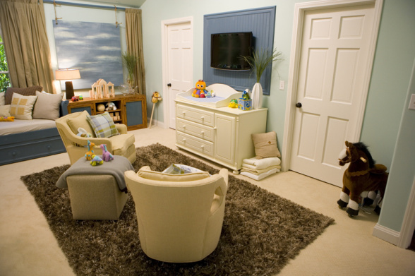
This room has so much going on, I feel like when baby grows up he won't need to leave- TV already?!
Also, for the rooms that double as guest bedrooms are the babies kept in their rooms when the guest come over?
cottonlily
Thursday 29th of April 2010
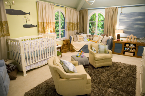
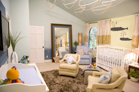
I think this is a nice room, just not a good design for a nursery. Can you imagine what all this will look like with baby and all her/his clutter added to it? I'm not a fan of matchy-matchy but the different draperies make it seem like they ran out of fabric and had to go buy some cheapies to finish the other wall. It seems the designer was trying to give the room too many purposes. Is it a nursery, an entertainment space, a living room? I like the design of the chairs, but do you really need 3, plus an ottoman, plus a sofa in a nursery? It sort of looks like they moved all their extra furniture in this room. The TV absolutely HAS to go. I agree that babies (children and adults for that matter) are watch far too much television. Why get them hooked as an infant? Besides, it's not an attractive feature. And the giant mirror propped on the wall?! Are you kidding me? Has this designer ever spent any time with a baby? This is an accident waiting to happen. I do like wall color, the two-toned drapes, the corner lighting and the sky artwork.
admin
Saturday 9th of January 2010
AD says:
September 15, 2009 at 12:51 pm
To me, this is a total disaster. Where to begin? Its visually cluttered. My eye doesn’t know where to fall, which leaves me feeling anxious. There are just too many elements, too many pieces of furniture, too many colors. What’s with the half painted mural on the wall with the mirror? Totally unnecessary. And the mirror itself? That frame is way to heavy for the space. Why a celery green accent wall? How does that fit in? Accent wall or mural, one or the other, but not both please. The furniture is quite pedestrian and looks cheap even though I’m sure it was rather pricey. Really hate the area rug. The curtains look sloppy and poorly sewn. I love pillows, but the ones on that day bed just aren’t working. Again, too many colors, patterns, and motifs. And while I like sophisticated decor for children, this is totally out of touch with what is safe for an infant. My son would have eaten the plants, broken that glass fish sculpture, and put a toy through that mirror within the first year of his life. A TV above a little boys changing table? Not a good idea for so many reasons. Lets be reasonable here. What works for me? The wall color is lovely. I would have stuck with a palette of that aqua, white, and sand. The room itself has some lovely details … the windows are gorgeous, but they are lost behind too much fabric poorly placed. This room needed to be edited big time.
admin
Saturday 9th of January 2010
Sabrina says:
September 14, 2009 at 6:12 pm
I love the serenity of the palette too and the boat shapes and fun whale art. It’s functional but I agree a TV over the changing table is just really bothersome and there are too many chairs. Practically speaking, you need free space at least by the end of the first year for play. I understand it doubles as a guest room but what guest is going to be watching TV while the baby is in there? But seriously, what are the chances Jason Priestly doesn’t have another room to act as a guest room?!
admin
Saturday 9th of January 2010
bibzees says:
September 14, 2009 at 9:48 am
I have to say I LOVE this room….the color pallete is so serene. I actually think the seating and reading area in front of the TV is not such a bad idea. The amount of hours I spent out on my living room couch for middle of the night feedings justifies an in room nursery tv to me. That and the fact that it substitutes for the guest room are reason enough for me. Not to mention you can obviously control what your infant is watching and put up a cute fish screen saver! The only thing that I don’t really understand is the 3rd chair in the corner. That seems extraneous and takes up too much space. Other than that I LOVE it!