Shop Suggestions
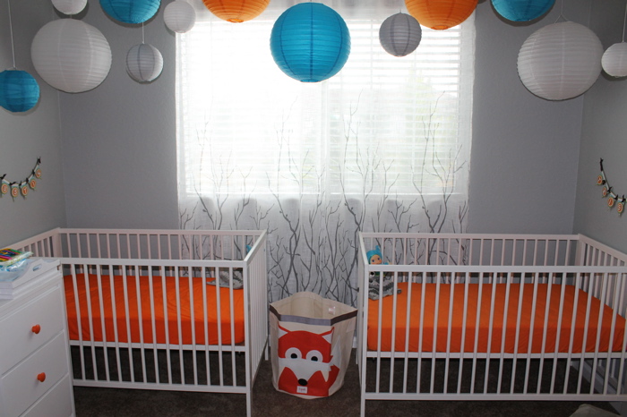
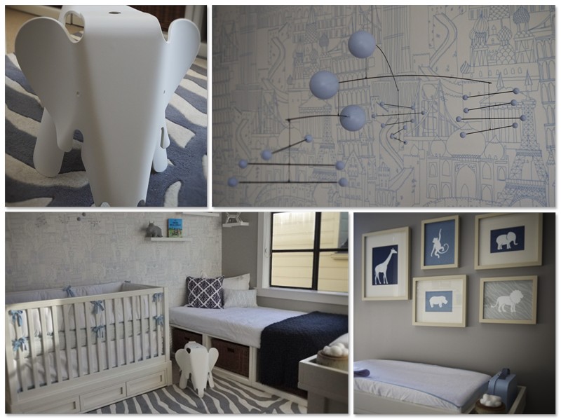
I worked really diligently on this nursery because I wanted to create a space for my son that is colorful, enjoyable and relaxing to be in, and that would foster his sensory development and creativity. I also wanted it to be able to transition easily to toddler and childhood, and to not start out too babyish. I guess that’s a pretty tall order, but I am pleased with how it came out. We tried to keep the budget very small, and most of the furniture was either given to us or repurposed from some other part of the house.
cjoy


Comments
Ross Neytiri
I so love that long frame with the REMINGTON photos! It’s so creative and I think it’s the first time I’ve seen this name sign technique.
Jillian Scotts
Me too! I definitely like the concept. I’m thinking about “copying” the idea and doing the same thing with my kids’ names. ;)
Manny Quin
You know what I love best about this room? It showcases the beauty behind all the photographs you’ve put in here!
Jordan Miller
What paint color is this?