This is our interview series where we bring you the nurseries and kid rooms of successful designers, entrepreneurs and moms. Through this series, our featured guests will divulge some of their design secrets and share stories of how their nurseries came to be.
Salt & Nectar is the passion project of two friends named Sarah. “The Sarahs,” as they appropriately call themselves, met in law school where they were editors of their law school’s only feminist legal publication. After they each spent some time working in D.C., they both returned to their home states to focus on building families. Their love for pop culture and DIY projects kept their bond strong, and they started Salt & Nectar, a blog dedicated to the salty and sweet, big city and small town, ups and downs, the pretty and the not-so-much of modern motherhood.
Sarah Holland, now based out of Paducah, KY, has blog posts featured on USA Today, BlogHer and more. She also writes essays about the triumphs and everyday struggles of motherhood. It’s no secret that this mama of two is full of smarts, but we also got the treat of seeing her creative side beyond the blog—Sarah gives us the inside scoop behind her son Amos’ colorful nursery.
Tell us about your design process. Did you start with one central item or idea that served as your inspiration?
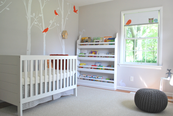
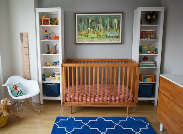
I started with the colors and a loose theme. I wanted to use gray and a woodland theme. We actually did a design inspiration contest on the blog, which was a lot of fun. I actually ended up using several of the items on the submitted inspiration boards!
What’s the first thing people notice when stepping into this room?
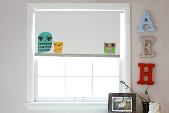
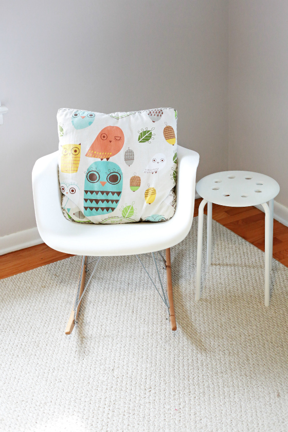
Visitors love the shades, which are one of my favorite items in the room as well. These represent a great combination of design (the adorable owls) and function; I knew I needed a way to darken the room for a sleeping baby.
Do you have any words of advice for other designers and parents?
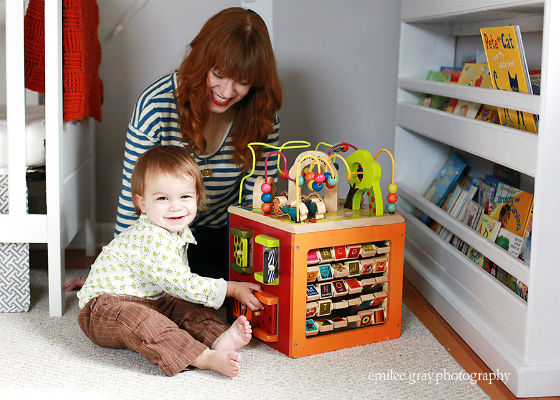
I always tell my pregnant friends to get a forward-facing bookshelf. My stepfather built one for each of my sons, and I think it is a fantastic way to make books a part of the decor. I also think it really encourages the child to read and interact with the books.







Comments
amina
an kidroom very very beautiful…!!!
all inspiration!!
Ross Neytiri
Really nice. It’s clean and simple.
moira
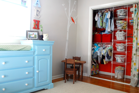
I like the light-colored walls and furniture, with the bright red of the open closet, the bird wall decal and the letter H popping out.
Germaine
That little wooden table and chairs at the corner are sooo cute. They remind me of Goldilocks and the three bears.
Lizabeth Olivier
I’d be curious about how you like your bookshelf. Is it easy enough for your little one to take their own books out?
Andrea Lowe
Love the powder blue dresser and the owl shades! Gorgeous!
Lisapeck
Running a contest on your blog is a great idea. This will help you get a lot of suggestions and a lot of wonderful ideas. Maybe Project Nursery could have something like that, the search for the ultimate nursery with suggestions coming from readers?