You know what’s super challenging and incredibly smart all at the same time? Giving your first baby’s nursery furniture a new life by reusing it in baby #2’s nursery, all while making the space feel different and special and personalized for each of your littles. You’ll save money by not purchasing the same items twice, and you might even be able to splurge for the crib of your dreams if you know you’ll be using it for the long haul.
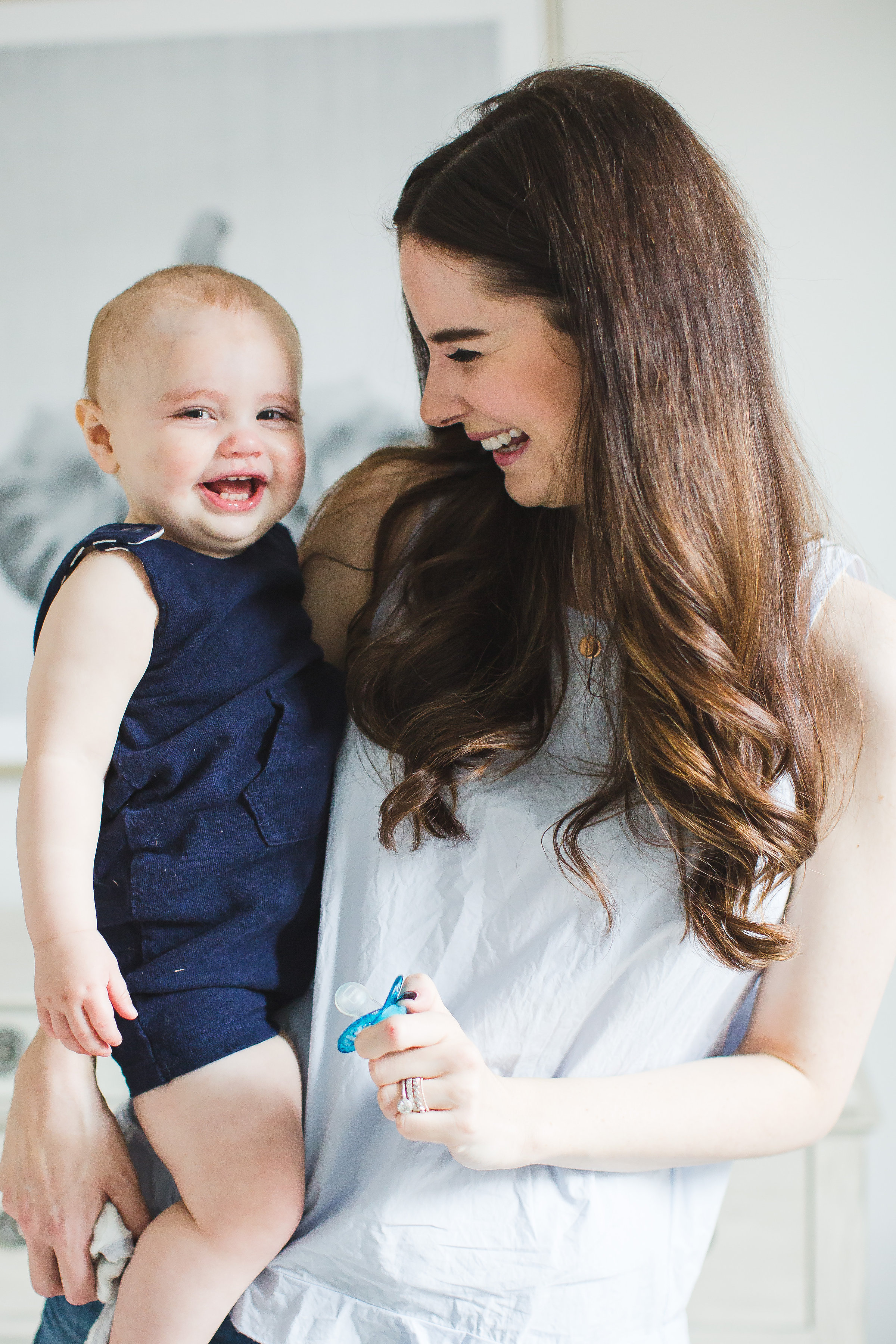
The challenge arrives when it comes to making the pieces feel fresh and new when you’re ready to use them the second time around, and today we’re chatting with Veronika Romeis of the lovely lifestyle blog Veronika’s Blushing about how she did exactly that. Mama to three-and-a-half-year-old Harper Reese and fourteen-month-old Lincoln Grey, Veronika is here today to give us a peek inside Lincoln’s bright and airy safari-inspired nursery and share her tips for a successful nursery design.
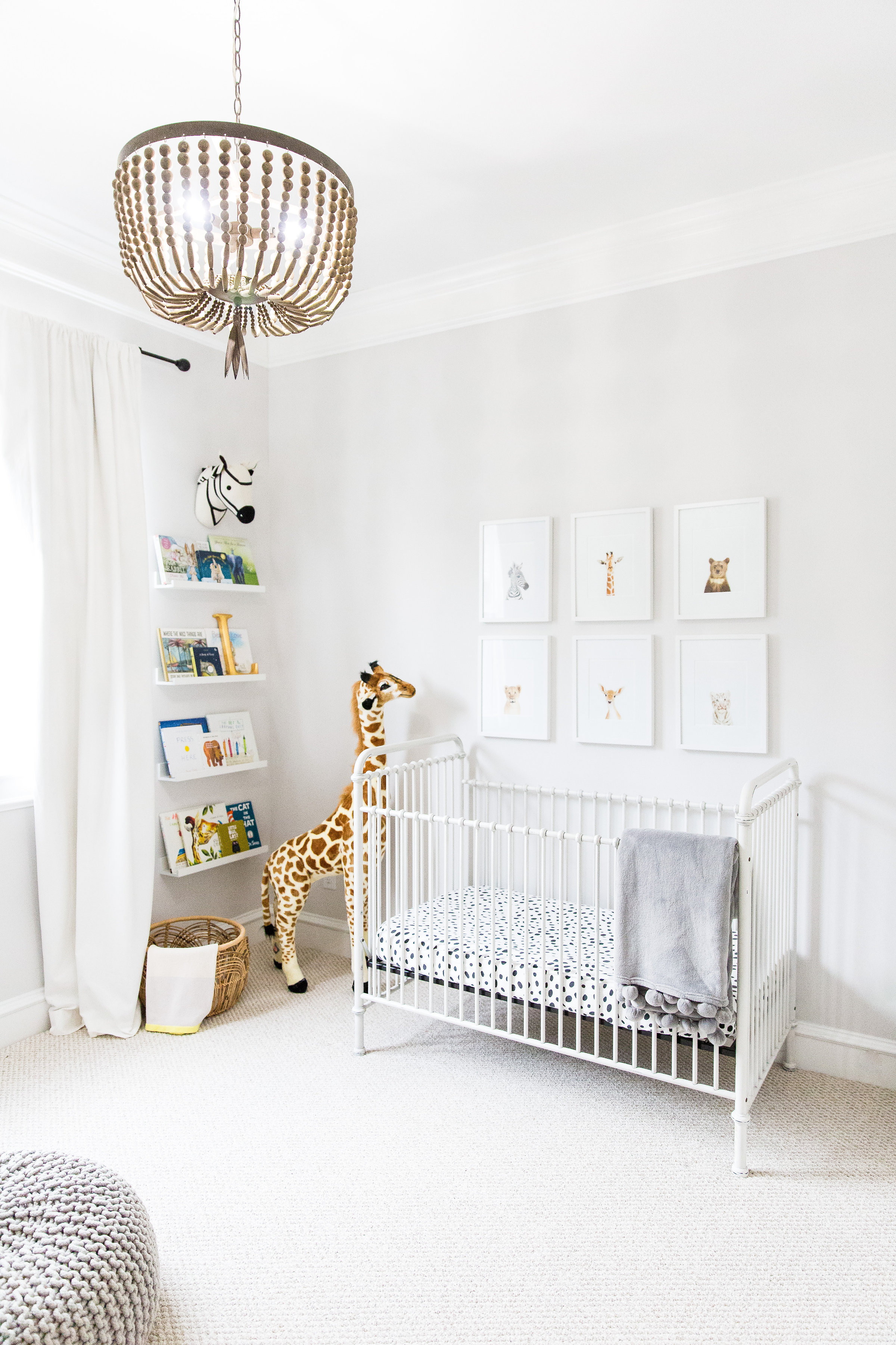 Wall Color | Wood Pendant | Crib
Design inspiration can come from anywhere—what inspired your nursery design?
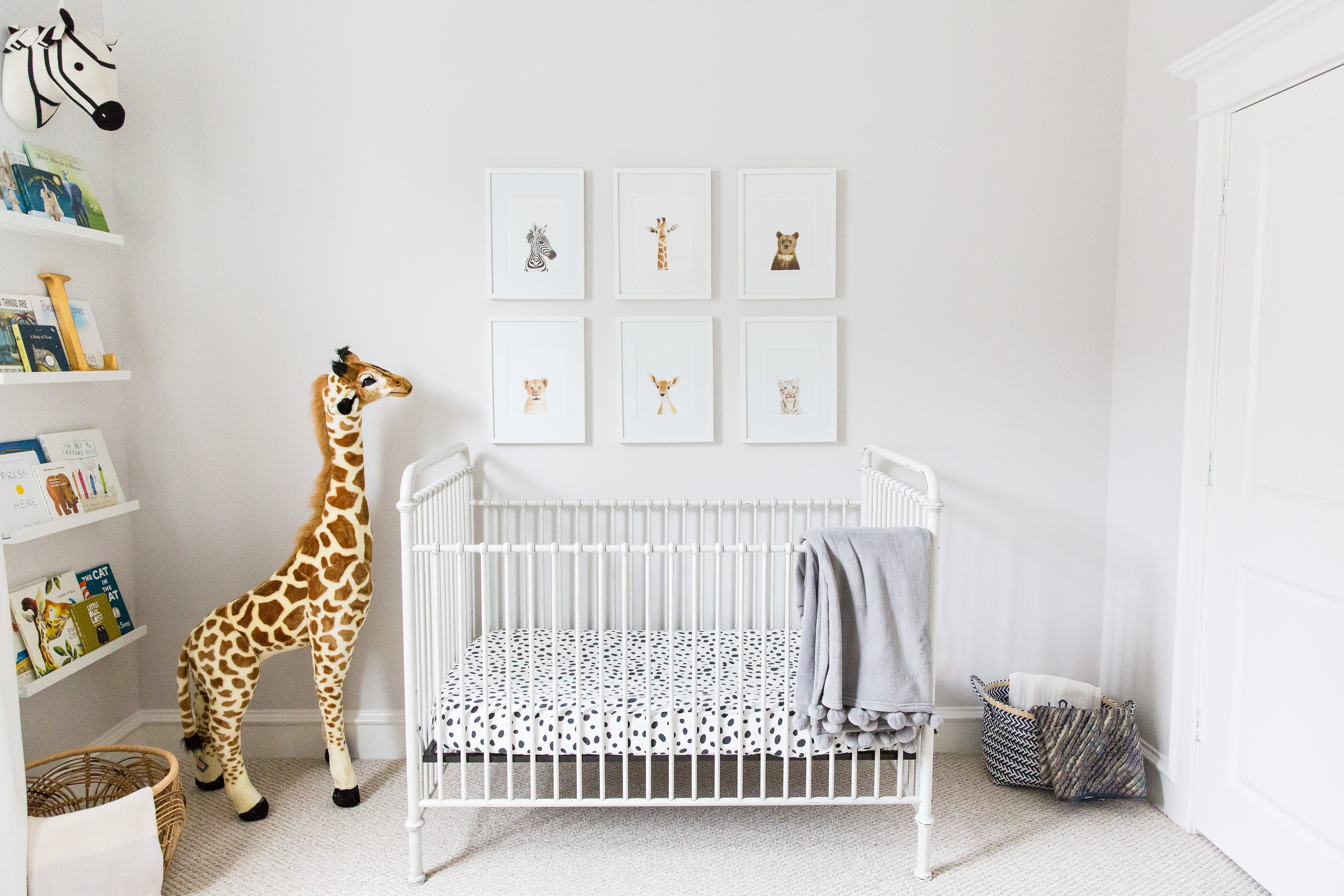
When I was pregnant with my daughter Harper, I saw Sharon Montrose’s baby animal prints and became enamored with them. At that point, I had already designed her nursery, but I told myself I would use the prints as the design inspiration for our next baby. When I was expecting my son, I immediately knew I wanted to do a very light safari theme in his nursery and that Sharon’s images would be a focal point of the room. They’re just so sweet and whimsical!
How did your design evolve when you transitioned from the planning phase to the execution of your vision?
We moved into a new home when I was nearly nine months pregnant(!), so I didn’t have a chance to even start on Lincoln’s nursery before he was born. In fact, my daughter was still sleeping in the crib that would later be his. My vision for the nursery was always pretty consistent because I knew I would be using all of the same furniture from my daughter’s nursery but making it his own. The most challenging part of designing the space was actually executing it—Lincoln’s nursery wasn’t complete until he was a year old.
How did your personal style influence your design choices?
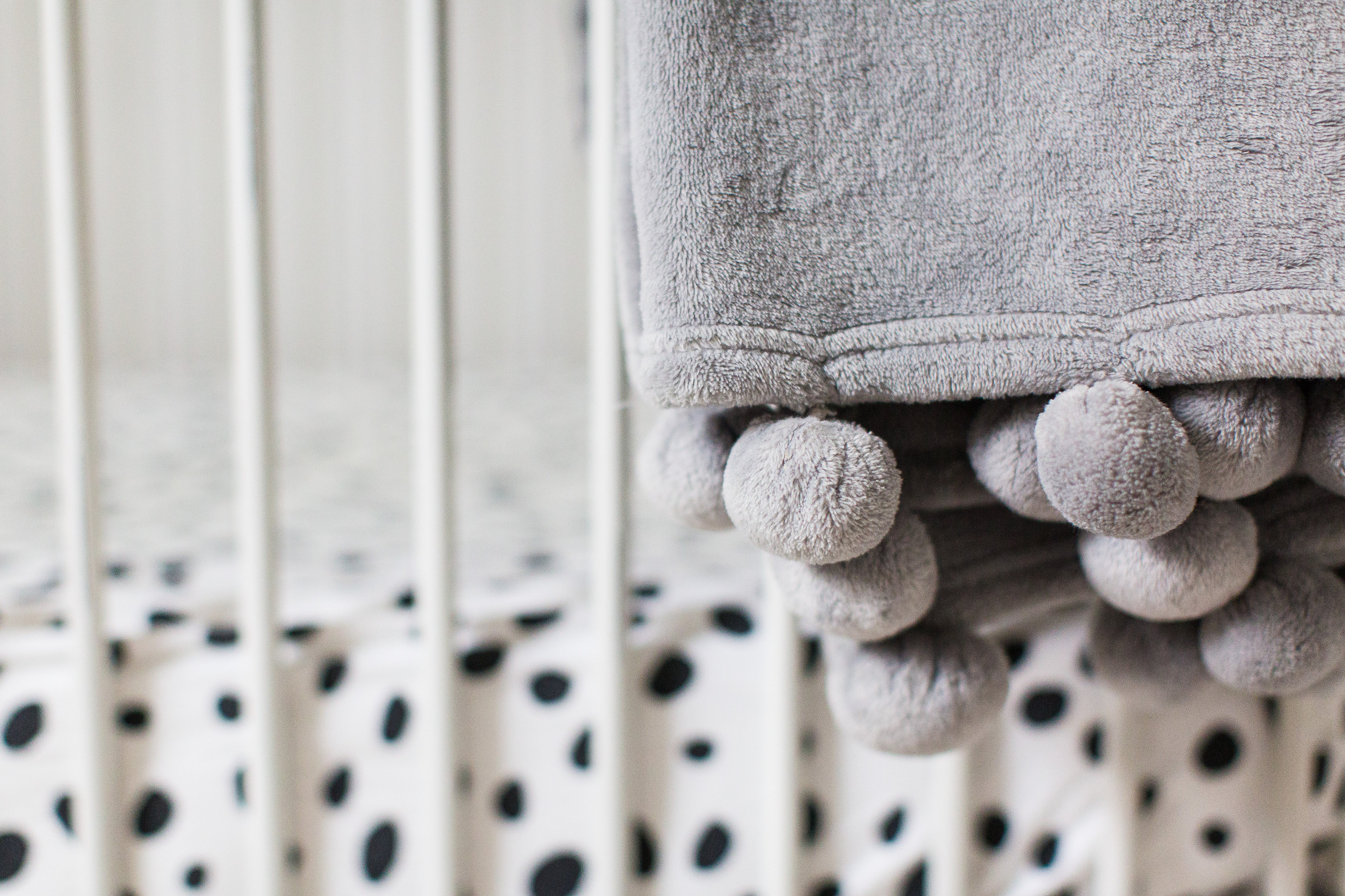
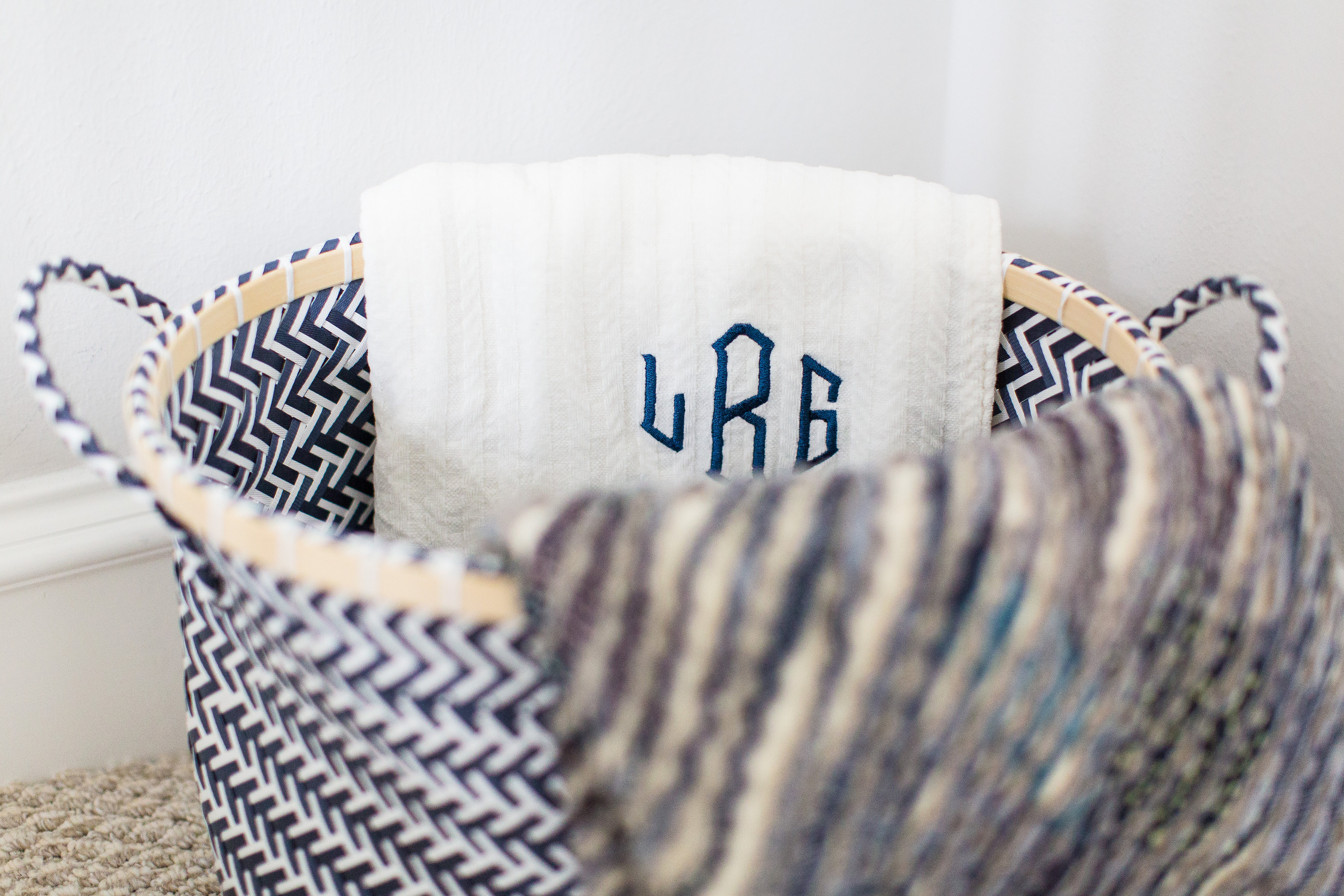
I like really clean, crisp and bright spaces. For nurseries, I love a calm and serene setting, so I knew I wanted Lincoln’s space to be neutral, just like my daughter’s was. While I love neutral spaces and lots of white, I also love prints and patterns and was able to incorporate the sweetest spotted crib sheet and some pops of color on his book shelf. I love a room with lots of different textures, which is why you’ll see storage baskets and blankets made of different materials in the space. I love the layered effect it creates—it just makes a room cozier!
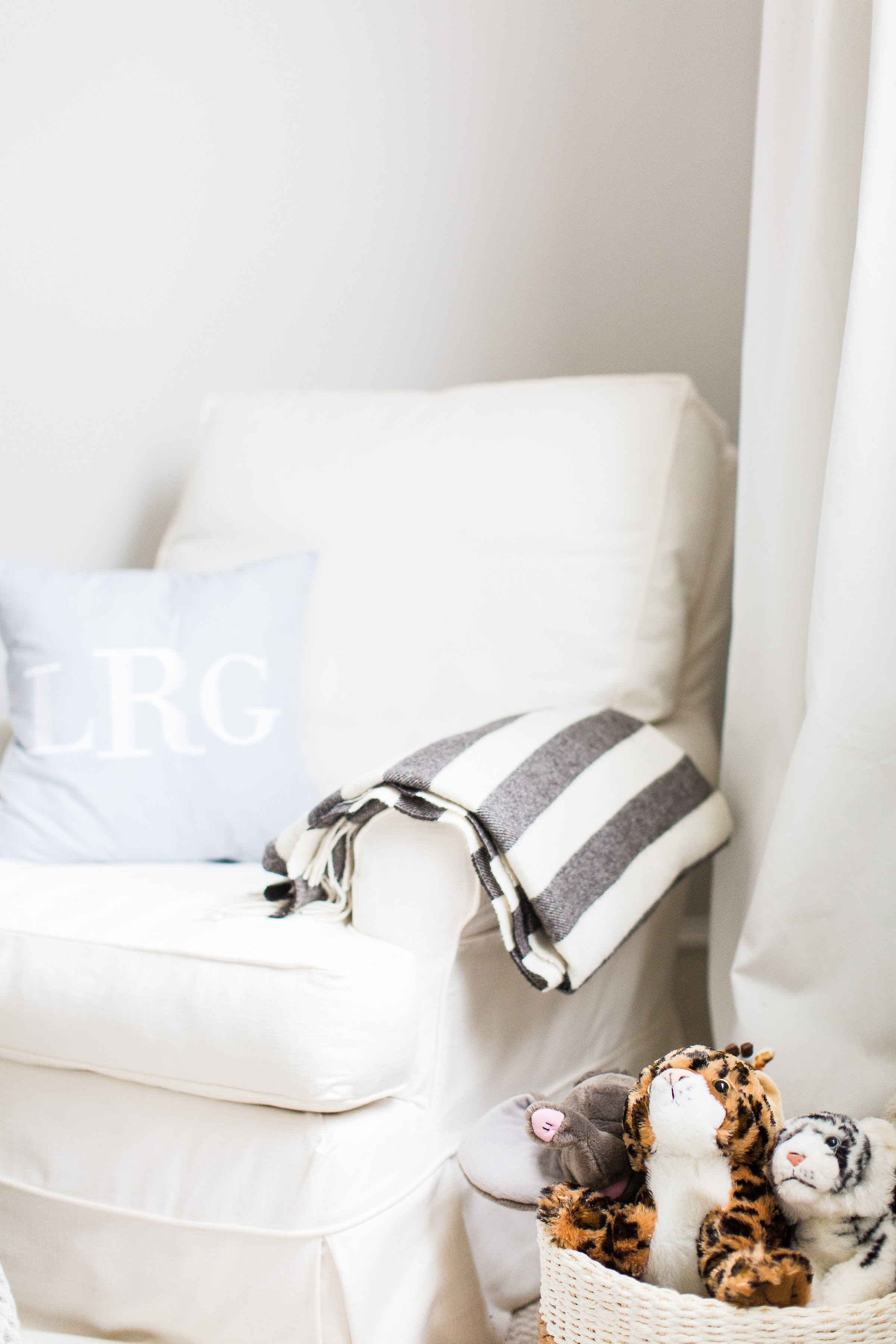
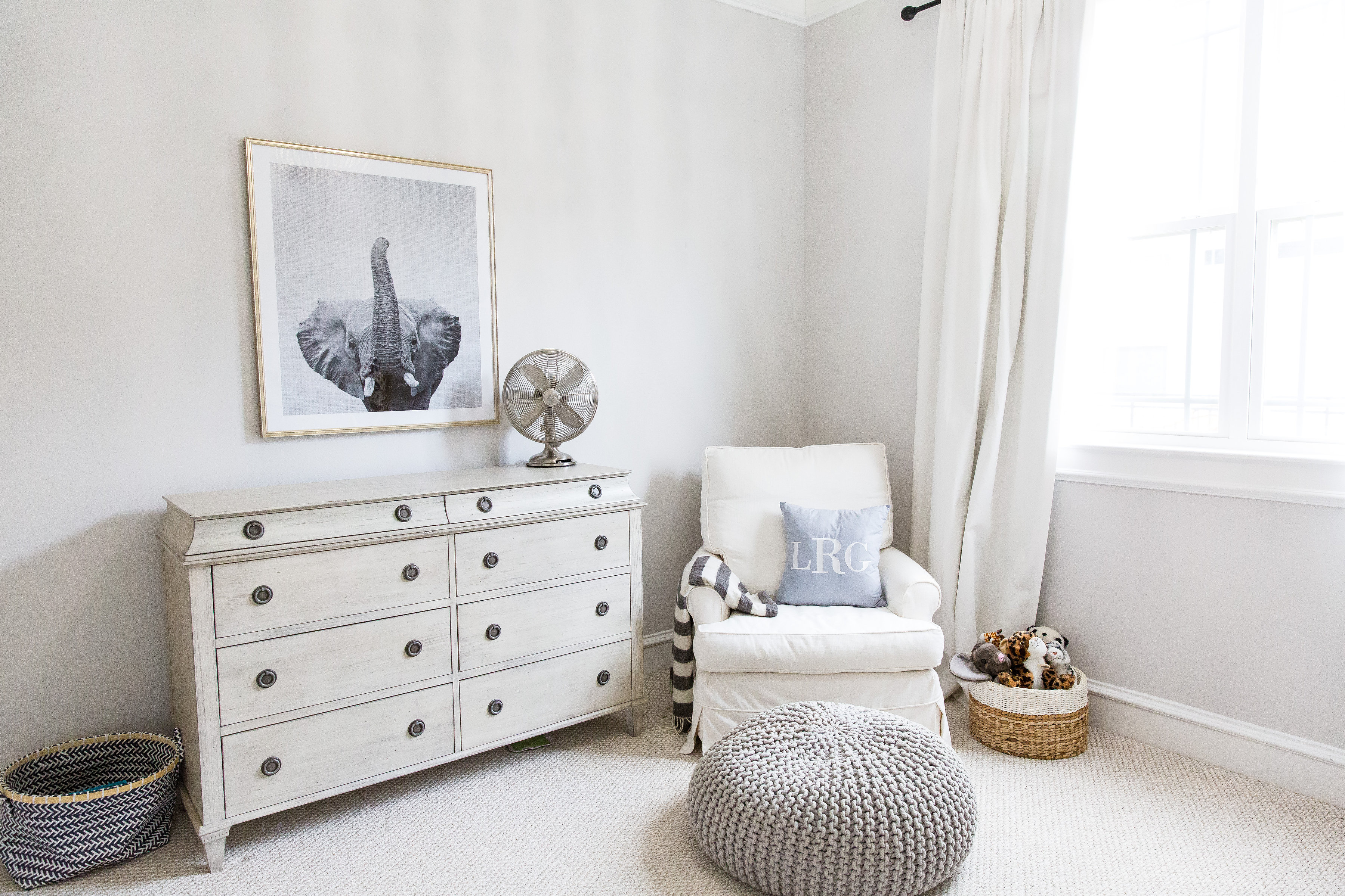
 Monogrammed Pillow | Basket (similar)
Did you have any unexpected obstacles when creating this room? How did you overcome them or spin them to your advantage?
My biggest challenge was just getting it done! I went back to work full time, and all of the nursery-related projects just fell by the wayside. One thing that could be perceived as a challenge was that I used the exact same furniture in Lincoln’s nursery that I did in my daughter’s. So using the same pieces while making the room have a different feel overall was something I actually enjoyed doing!
Now that the room is complete, what was your favorite part of the process? And what do you love the most about the finished design?
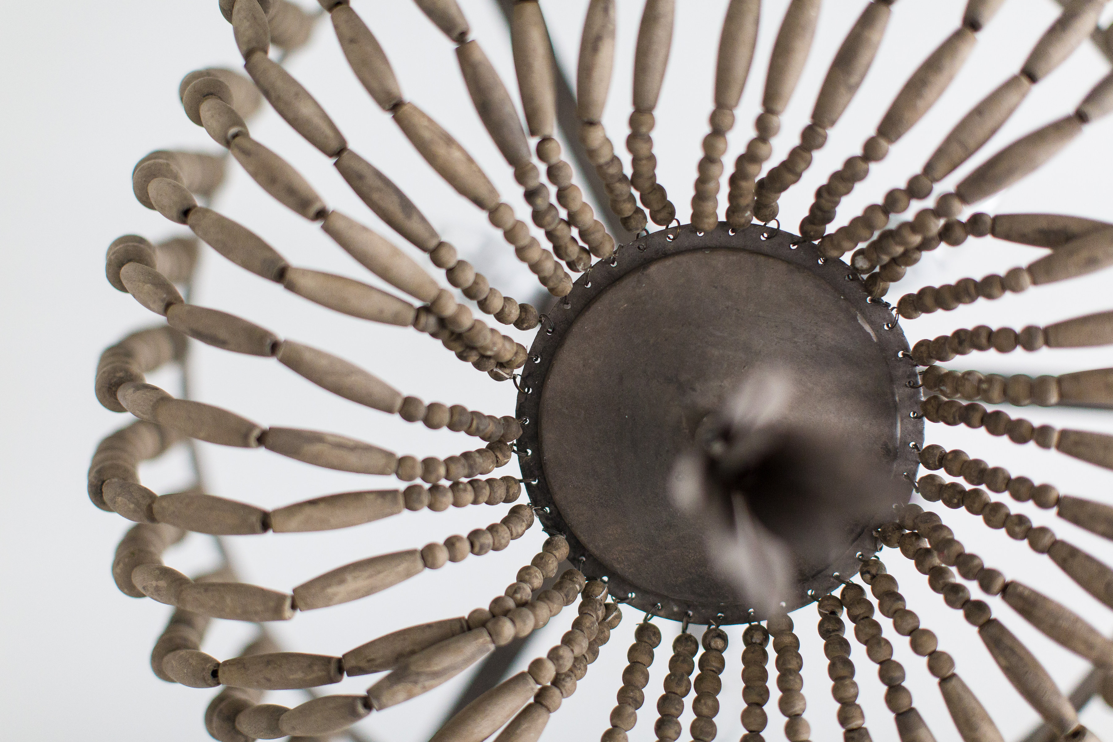
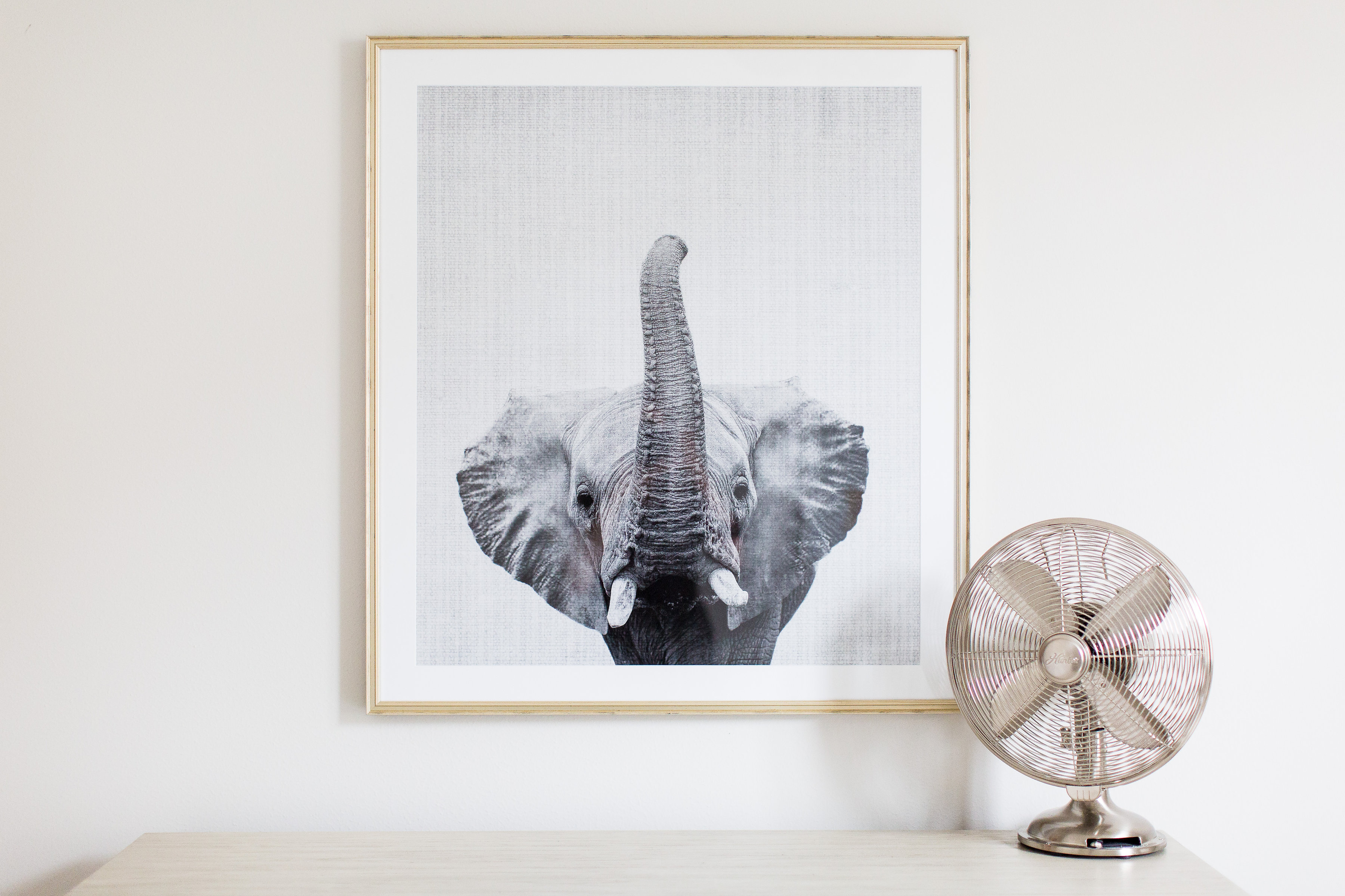
My favorite part of the process was taking my time selecting the details of the room, like the artwork and accessories. I’m so happy every time I step inside that room! One item we purchased new for the nursery is the Restoration Hardware light fixture, and it’s one of my favorite elements in the room. I just love the wooden beading and tassel and how it’s such a standout piece in the room. I also adore the elephant print we had framed by Framebridge. I went with one large piece over the dresser so it would really make a statement since it’s on the side of the room opposite of the crib where so much is going on. I love that it’s such a strong piece that will transition well to a “big boy room” one day.
What is that one thing that everyone mentions when they step into this space?
How airy and bright the room is. The giant plush giraffe is also a big hit! It’s something I purchased before Lincoln was born knowing I would want it to be part of his nursery. I love using plush animals in kids’ rooms, and this giraffe makes such a great impact in the space—we even have an identical one in our playroom!
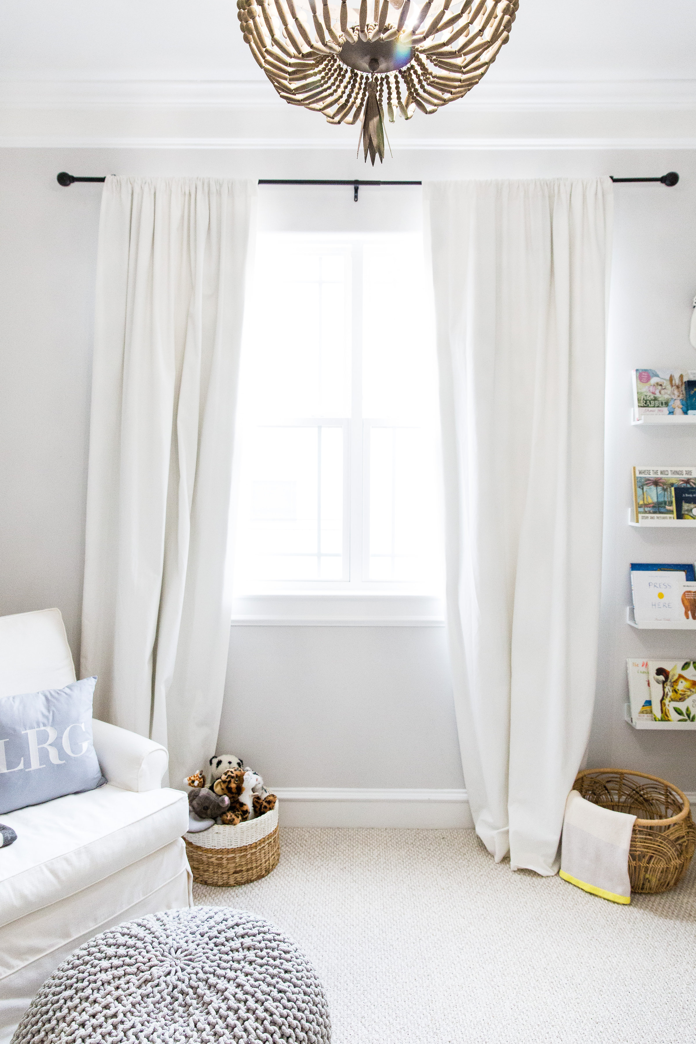 Curtain Rod | Curtains | Basket | Blanket with Citron Trim
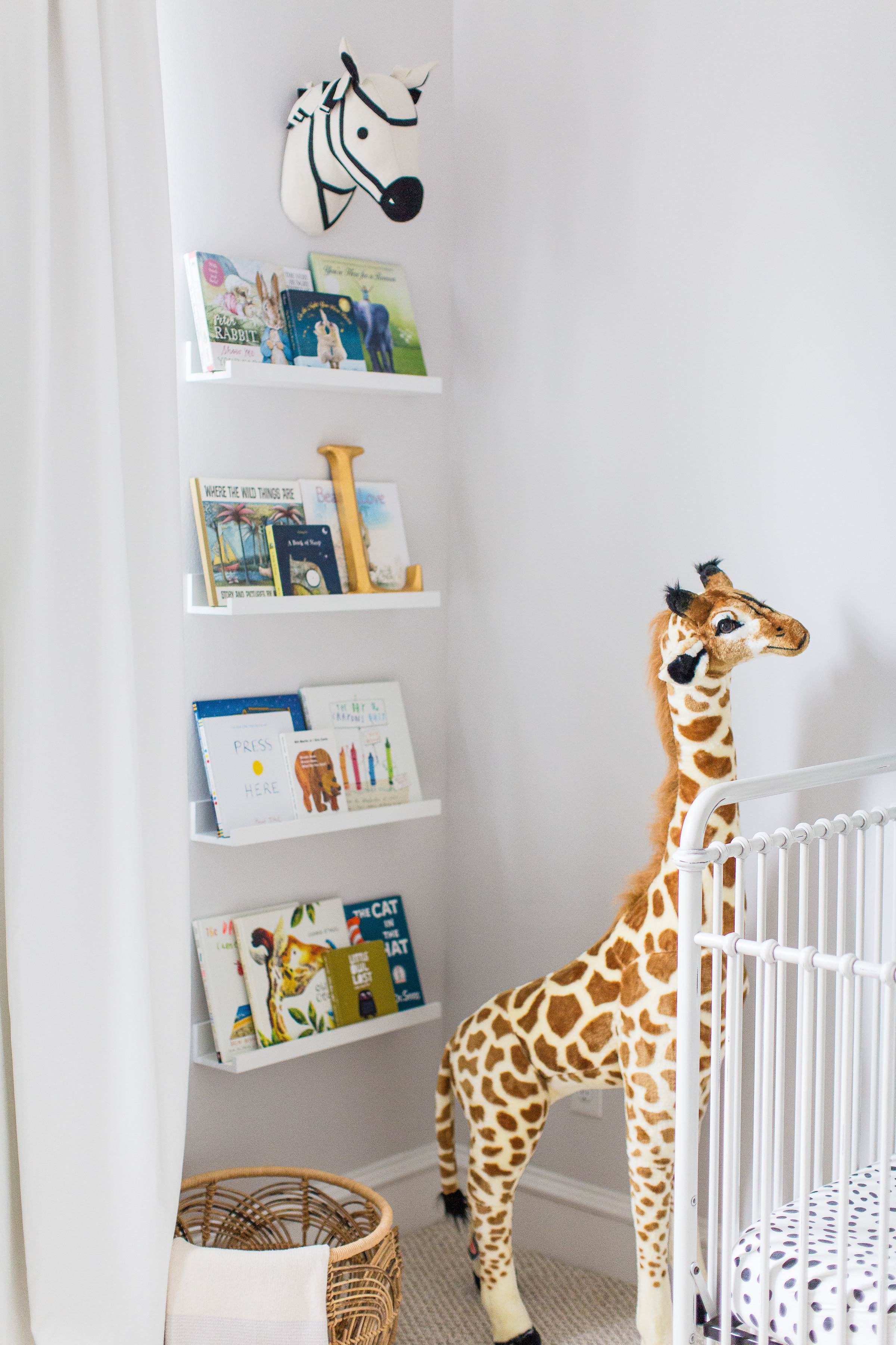
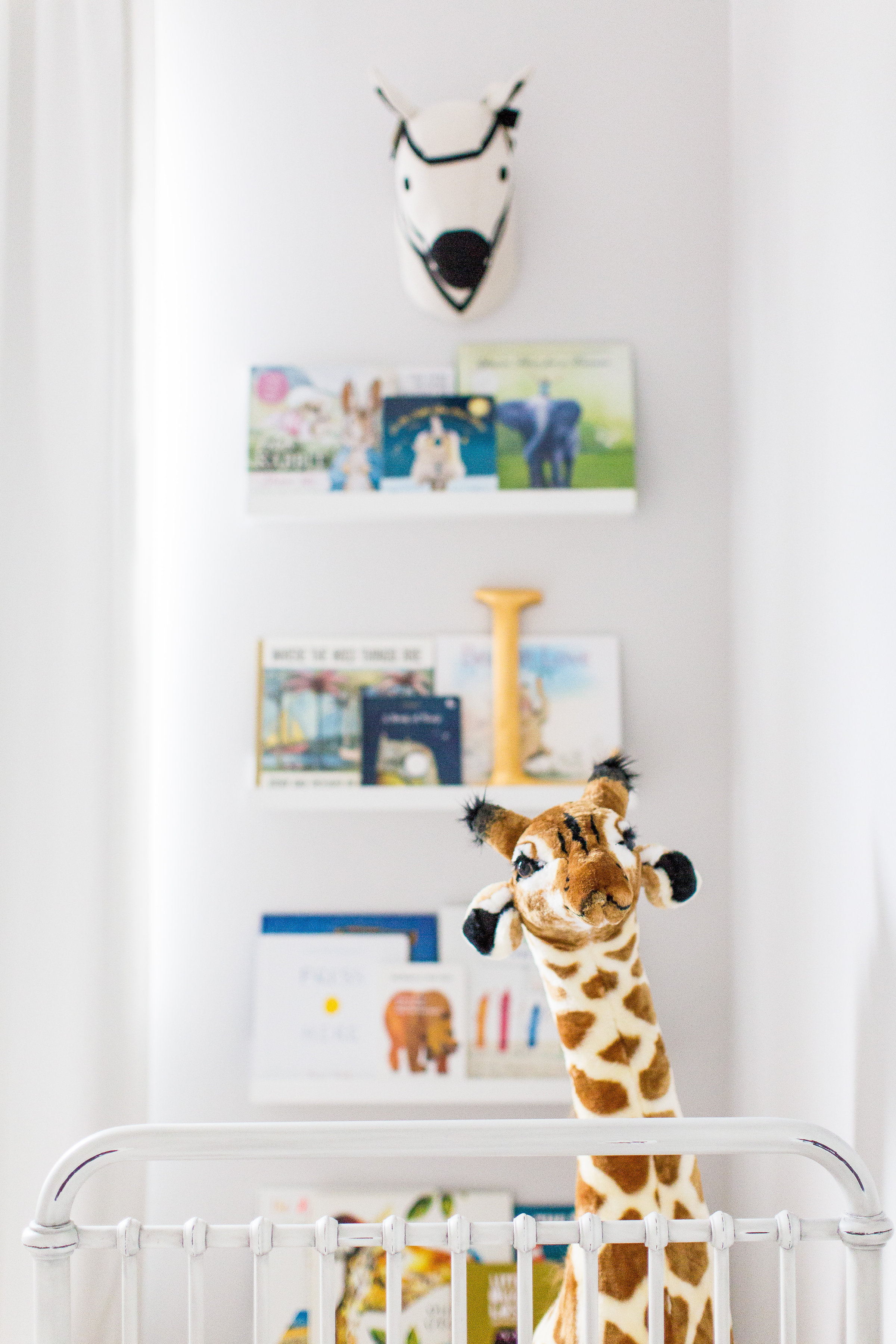 Zebra Faux Taxidermy | Book Ledges | Giraffe
What were your nursery must-haves when you started? Has that changed since you started using the space?
Because Lincoln is our second baby, I already knew what worked well with our daughter, and we used the exact same gender-neutral pieces from her nursery. I recommend that every nursery has a rocker or glider. I still rock my son to sleep (he’s my last baby!), and I enjoy the comfort of that glider every single day—it’s a must-have!
What is the one thing that you would tell other parents to consider when they’re starting their own nursery design projects?
Start with a main piece of inspiration and go from there. Decide on the feel you want for the space (calm and serene, bright and colorful, playful and whimsical, etc.), and try to find a way to incorporate elements that help your vision come to life. Also, scour Pinterest and nursery websites like Project Nursery for ideas and inspiration and make those ideas work for your space. The other thing I recommend is keeping it simple. We never had a changing table in either nursery because it was one more piece of furniture that took up space and doesn’t transition to a big kids room once the child is potty-trained.
Photography by Jacquelyn Nicole Photography
SaveSave




Comments
Sydney Armes
Love this post! Would love to decorate my little boy’s room just like this. One question, where did you get the elephant print? That is a must have for me!!!!
Miranda
Love this bright and airy nursery! What is the paint colour on the walls?
veronika
sydney – the elephant print is from Etsy — details on my blog, veronikasblushing.com
veronika
miranda – the paint color is SW “first star”
Krista
What a gorgeous nursery! Where is the giraffe from? The link in the post took me to a dead page. Thank you :-)
Beth
Hi Krista, We actually sell the giraffe in The Project Nursery Shop.
T. Ann
How long are the bookshelves on the wall? Did you make them or buy them?
Sara
Beautiful nursery. What brand, style and color is your carpet?