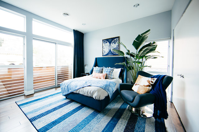
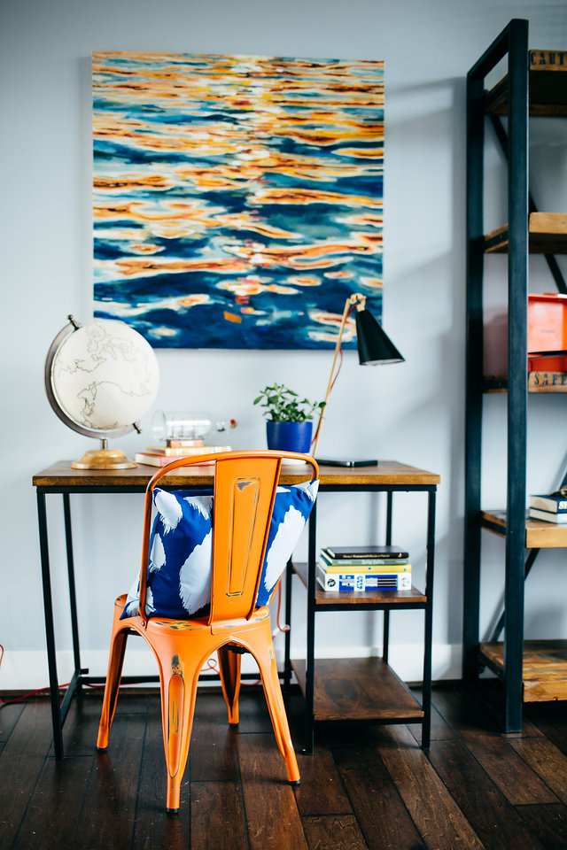
If you are looking for some help with your nursery design, Project Nursery’s design partnership with Decorist is something you will definitely want to check out. We launched our collaboration with our favorite online interior design service a couple of months ago, and we are continuing to feature some of the very talented Decorist designers here. So without further ado, we’re now introducing you to Melissa Schenck-Thomas, whose fabulous talent is something we’re thrilled to share!

What is your design style? How do you work it into children’s design?
I’m a true eclectic at heart. I love mixing texture and organic pieces that are a bit unexpected with modern and mid-century elements. It translates well to children’s spaces because I love a kid’s room with fun pops of color, texture and a bit of whimsy.
What is your design process for beginning a project with a client?
I love to learn as much as I can about the child I’m creating the space for—working with my client through inspiration images they’ve gathered and together thinking about how the room can grow with their little one. All of this helps us hone in on a design style, color scheme and the furniture selections.

What is your number one piece of advice for parents when it comes to kid’s design?
Don’t get bogged down with themes! Focus on a great color scheme and fun patterns that can grow with your child and can be added to easily to transform it into a great toddler space and beyond. Try bringing current interests in with art that can be easily changed as your child moves on to a new favorite animal or superhero.
How do you keep nursery design fresh when so much is about function?
I always work in one unexpected piece—think a bold wallpaper focal wall or a fun element like a child-sized teepee or a hanging rattan chair.

Working with a small space is a common children’s room design struggle. How do you work around it?
If you are short on space, focus on the basics and then work on layering in other pieces. Think about a crib, rocker and dresser/changing table first, and then work in other pieces as space allows. Take advantage of vertical space, using wall-mounted shelves in place of a traditional bookshelf and sconces in place of table or floor lamps.
We named our 2016 nursery trends. What are you predicting will be popular in nurseries this year?
I’m looking forward to some bold prints this year in nursery design, both in textiles and wall treatments. I’d love to see these be inspired by nature—think cacti and other botanicals, mountains and calming ocean scenes—let’s bring the outside in in a bold way!
Images by Adrian Busse Photography via Popsugar Home
Shop your nursery design today.
Make sure to meet all the Decorist designers featured in our series.


