My latest design challenge was to figure out how to make visual sense of a space that is very nontraditional and asymmetrical. The ceilings are super high, and in one corner of the room, they slant downward dramatically. Take a look at how wall color, wall treatment and a well-chosen modern light fixture transformed this unbalanced space into a contemporary blue and gray nursery.
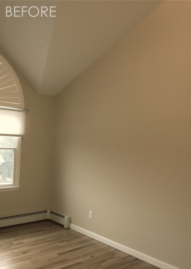
Initially, the space was painted with my new go-to neutral, Benjamin Moore Nimbus Gray. This color walks the line between gray and beige—it’s a pale gray with warm undertones. I also suggested—no, let’s be real—I implored my client to buy a modern light fixture. I literally said, “Just trust me, and buy this light!”
The super-tall wall where the crib would sit became our super-fly accent wall! A smart pattern of variegated stripes runs horizontally in a mix of matte and metallic paints. The metallic stripes shine in the light. The largest stripe is detailed with a sparse pattern of translucent pearl stars, and it became the home for the original whale painting.
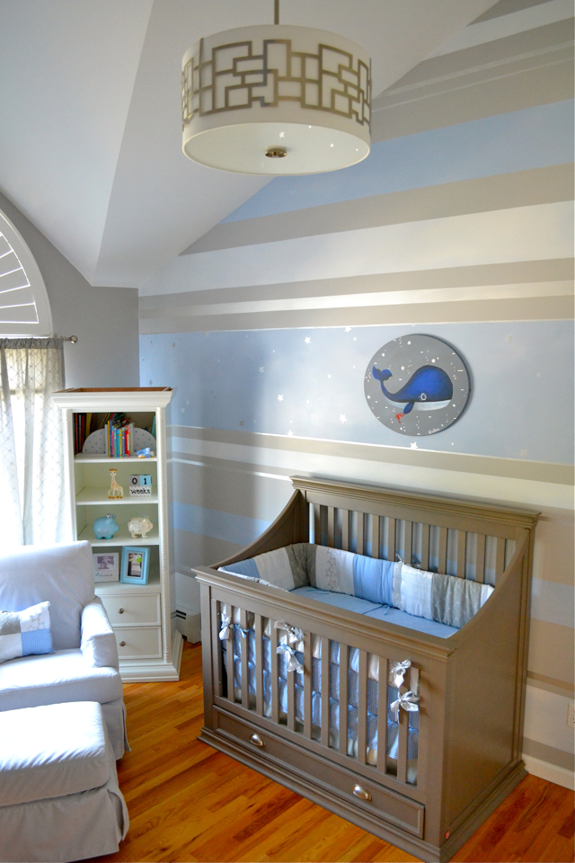
Back at my studio, we created the adorable, original “Whaley with his Little Crabby Friend” painting. I love using unusually shaped canvases. This oval contrasts nicely against the crib and all of the linear elements on the wall. The background of the painting adds a little sparkle with the metallic silver bubbles, starfish and guppies.

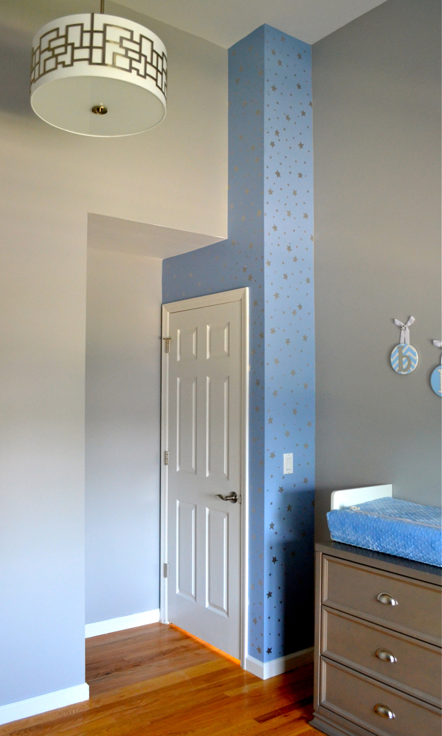
The soffit by the door looked odd and out of place, so I decided to color block it by draping it in a beautiful sky blue paint and hand applying an all-over pattern of pearlescent white stars. The stars shine outward when the light hits them.

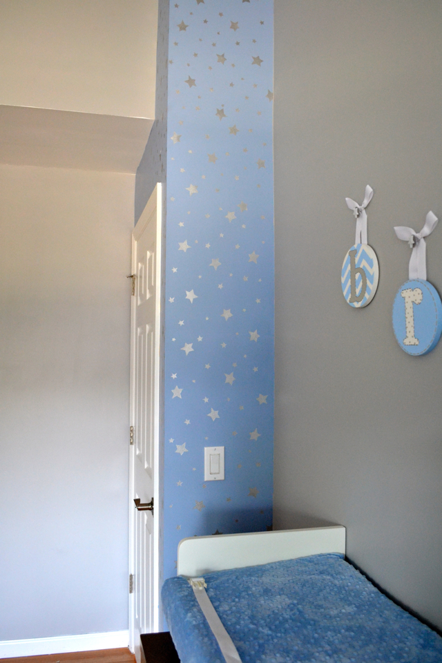
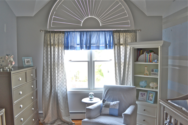
I love how the light spills through the window—the entire room seems to glow. The clean, classic furniture from the legendary Bellini looks right at home in warm grays and glossy whites. The room is now balanced, lovely and well-composed for its special new inhabitant.
What were some of the design challenges that you faced when you were creating your baby’s nursery?



Comments