My life is modern, but my heart is vintage—somewhere between 1940 and 1970. I’ve always had a soft spot for the looks of the mid-century. The clean lines and inherent homey charm of this bygone era always make me happy.
At a recent design event here in NYC, I had the pleasure of meeting demure design darling Kimberly Lewis. I’ve been a fan of her line of wallpapers for some time. With prints that are clean and charming, they all seem to say “welcome home.”
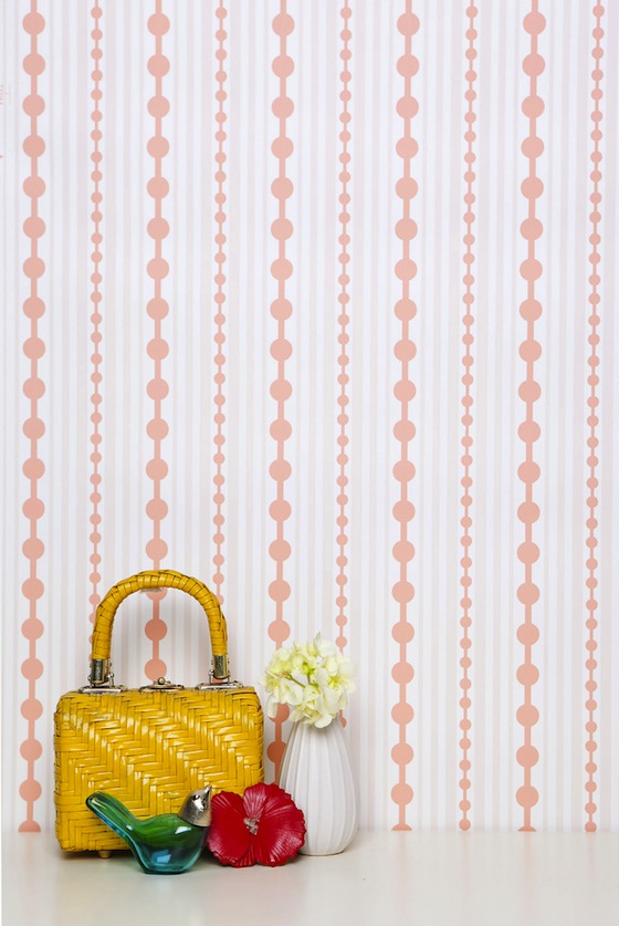
The stripes of dots below remind me of strands of pearls.

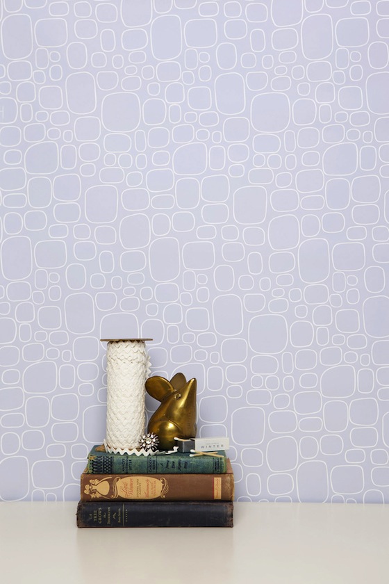
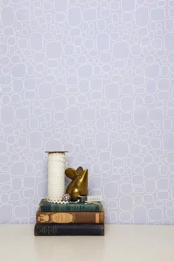
Graphic pattern need not be bold. The “pebble” pattern below is light and lacy. Soft rounded squares made up of white lines shine through a hazy lavender field.
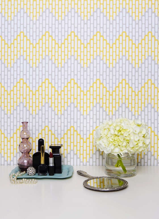
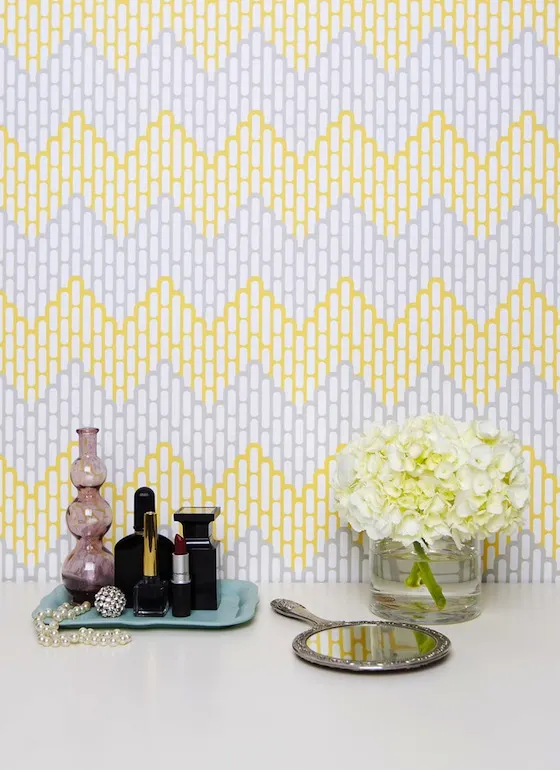
Kimberly Lewis is right on trend with this new take on chevron. The yellow and grey color palette is a Project Nursery reader favorite if the gallery is any proof. I’d love to see this paired with white lacquer furniture.
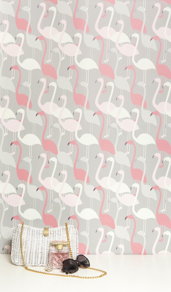
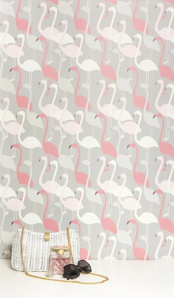
These flamingos kind of rock my world! Their graceful curvy lines and color palette nod to 1940s Americana—simply adorable. The other thing I really like about these flamingos is they are familiar without being cliche.
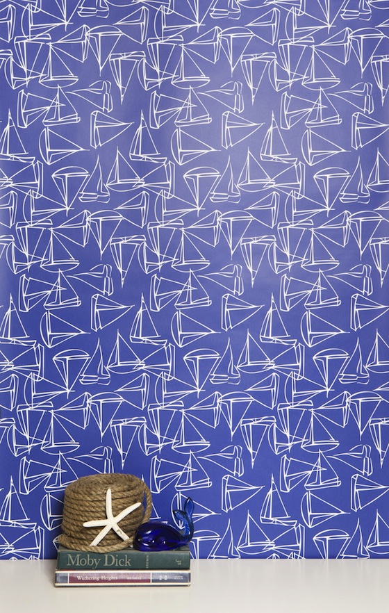
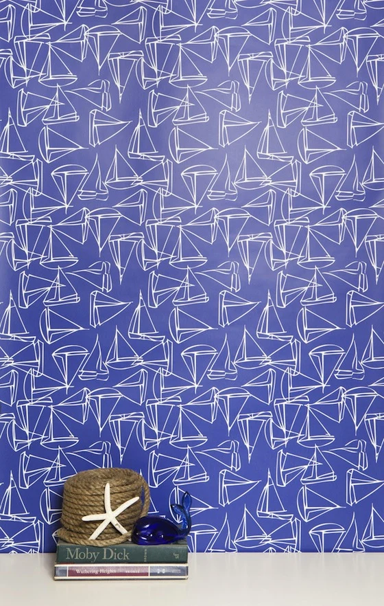
Once again, Ms. Lewis is right on trend with this rich cobalt and white nautical print. The thing that makes this so clever is the slight overlap of the sailboat illustrations. This look is exciting without being overly busy. I could see this as an accent wall behind a crib or all around the room beneath a glossy white chair rail.
NYC Nursery Reveal | Kimberly Lewis Home
Friday 11th of October 2013
[…] ps- Speaking of nurseries did you see this Project Nursery post? […]
Ross Neytiri
Sunday 6th of October 2013
I love all of them! If I were to choose only one, I wouldn't know which one to pick.
Sam Simon
Tuesday 8th of October 2013
Glad you like them! Design decisions are tough! Maybe choose the one that works best in the over all aesthetic and color scheme in your home.
Andrea Lowe
Saturday 5th of October 2013
Pretty wallpapers! I checked their site and I fell in love with the Ikat Greek Key and the Beverly designs!
Sam Simon
Tuesday 8th of October 2013
Glad you liked them! Beverly is a gem! XOSS
Kim
Thursday 3rd of October 2013
The pebbles one is gorgeous. Love my wallpapers light and subtle.
Sam Simon
Tuesday 8th of October 2013
Oh yes, that pebbles print has a lovely lace-like quality that is very light. It is pure ELEGANZA!
Jillian Scotts
Thursday 3rd of October 2013
I love the flamingo one. Though I'm not sure if it's just because of the glare on my PC screen, but they are more like optical illusions, where the lines and the images move and it's kinda difficult for the eyes to look at.
Sam Simon
Tuesday 8th of October 2013
Hmmm, I haven't experienced that- most prints look much better in person then on a screen. xoSS