


Description
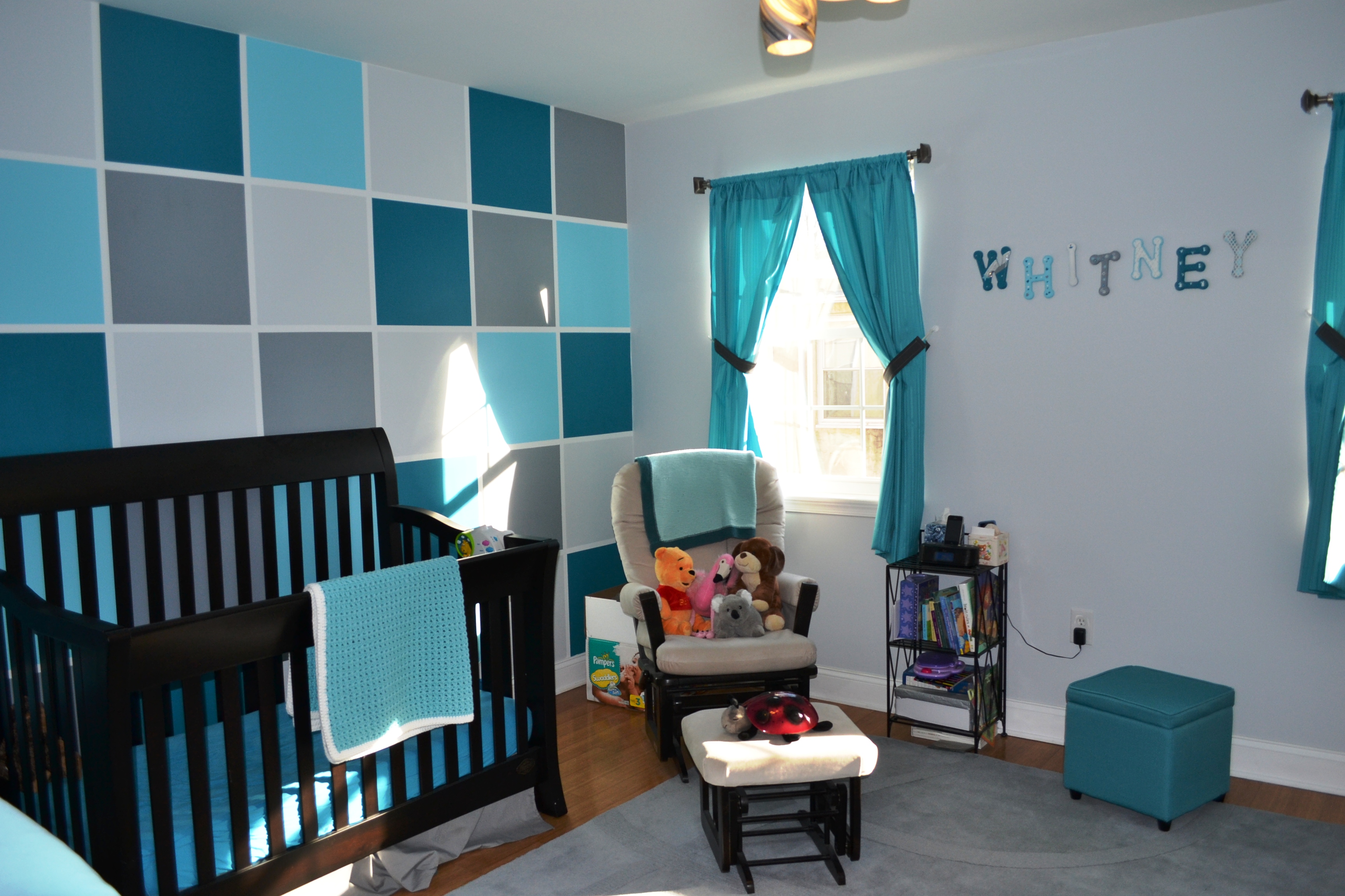
Without knowing our baby's gender beforehand, we wanted to create something gender neutral and loved the idea of gray and turquoise.
Design Inspiration
We loved the colorblock designs on Project Nursery and decided to apply our color scheme. I love the beach and anything turquoise so tried to incorporate both into the nursery.
Decorating Style
Modern, contemporary, colorful
Project Details
My amazing husband measured & taped the colorblock wall; using a random number generator we filled in each color.
For the name art, we had our immediate family members each design and paint one letter (they all signed the back too). Letters are from AC Moore and we used the leftover wall paint.
Crib is Bonavita Metro in Licorice: http://www.bonavita.com/products/collections/product-collection/metro-collection.html#null
Bookshelf is Ikea Expedit in black-brown: http://www.ikea.com/us/en/catalog/products/10196431/#/10103088
My husband added 4" legs to the unit so it was a little higher off the ground.
We printed two photo canvases for the wall. The artwork over the changing table were loosely inspired by various Etsy images and created by the amazing Valerie at Bull City Studio: http://www.bullcitystudio.com
Favorite Items
The name art - it was so special to have everyone create their own letter. They are all so different but really represent the person who painted it. I can't wait till Whitney is old enough to appreciate this special gift!
Advice
Graphic colorblocking isn't hard! You just need a good laser level and some patience- also go over the edges of the tape with a credit card before you start paining to get nice crisp lines. If you infuse the nursery with things you love, you will always enjoy spending time with your little one there, even during late night feedings and teething!
Andrea Lowe
Tuesday 19th of February 2013
Gotta commend you for what you did with that accent wall. You got some really beautiful framed photos too.