Here at Project Nursery, we adore a good nursery design, but when we get to peek inside the spaces that are dedicated just to play, we often spot a little bit of magic. The playroom is the place where a child’s imagination can truly run wild, turning a cardboard box into a castle, a blanket into a magic carpet or a play kitchen into a five star restaurant, and today we’re sharing a peek inside a bright and modern playroom that won our hearts at first sight.
Amanda Saiontz Gluck is the founder, writer, designer, stylist and party planner behind Fashionable Hostess, a lifestyle blog that’s filled to the brim with style and ideas for entertaining at home. And she put her eye for design to good use when she designed this inviting space for her two kids, Brooks and Reese. From the modern design to the retro toys, we’re in love with it all, and we think you will be too.
Design inspiration can come from anywhere—what inspired this nursery design?
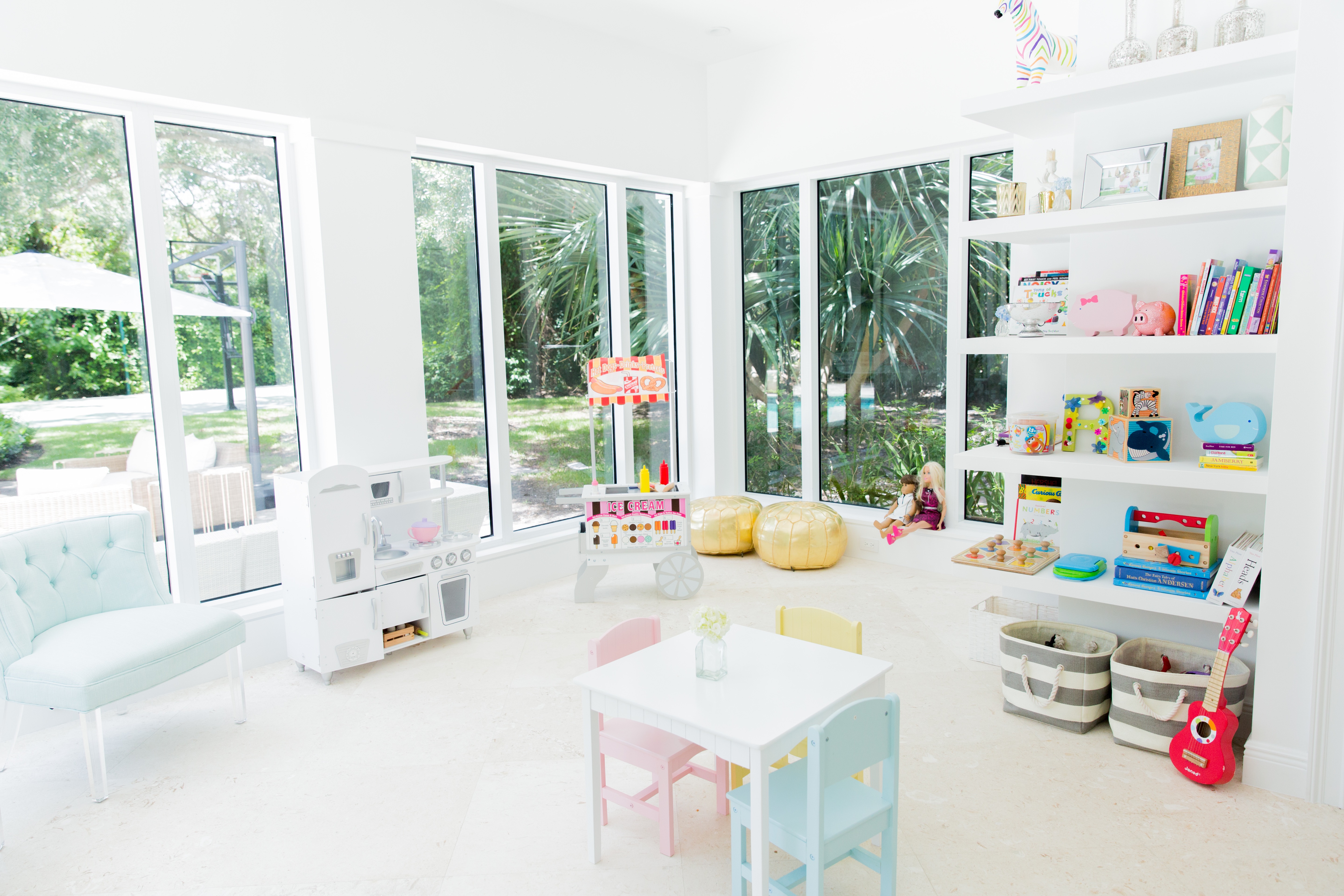
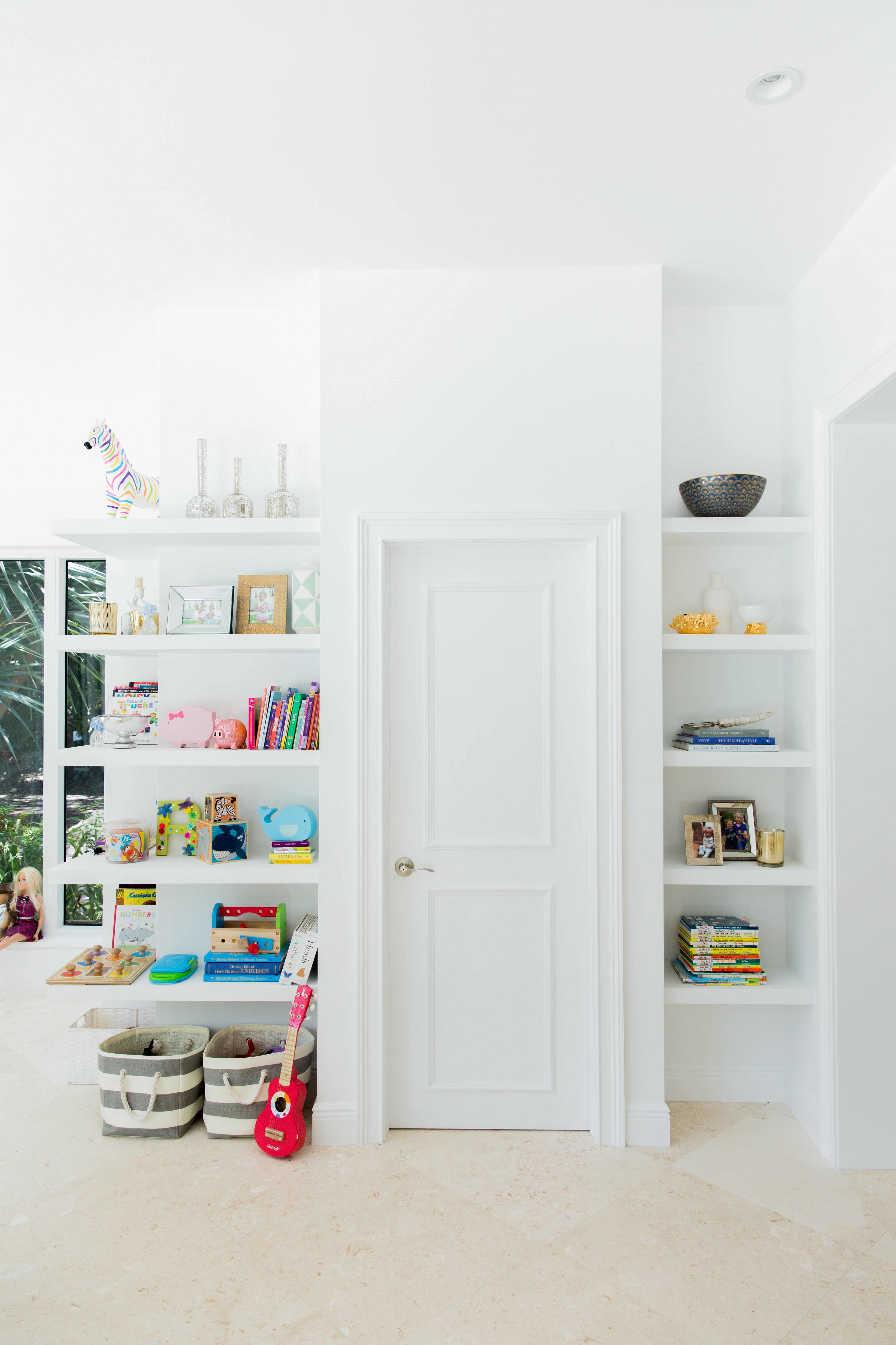
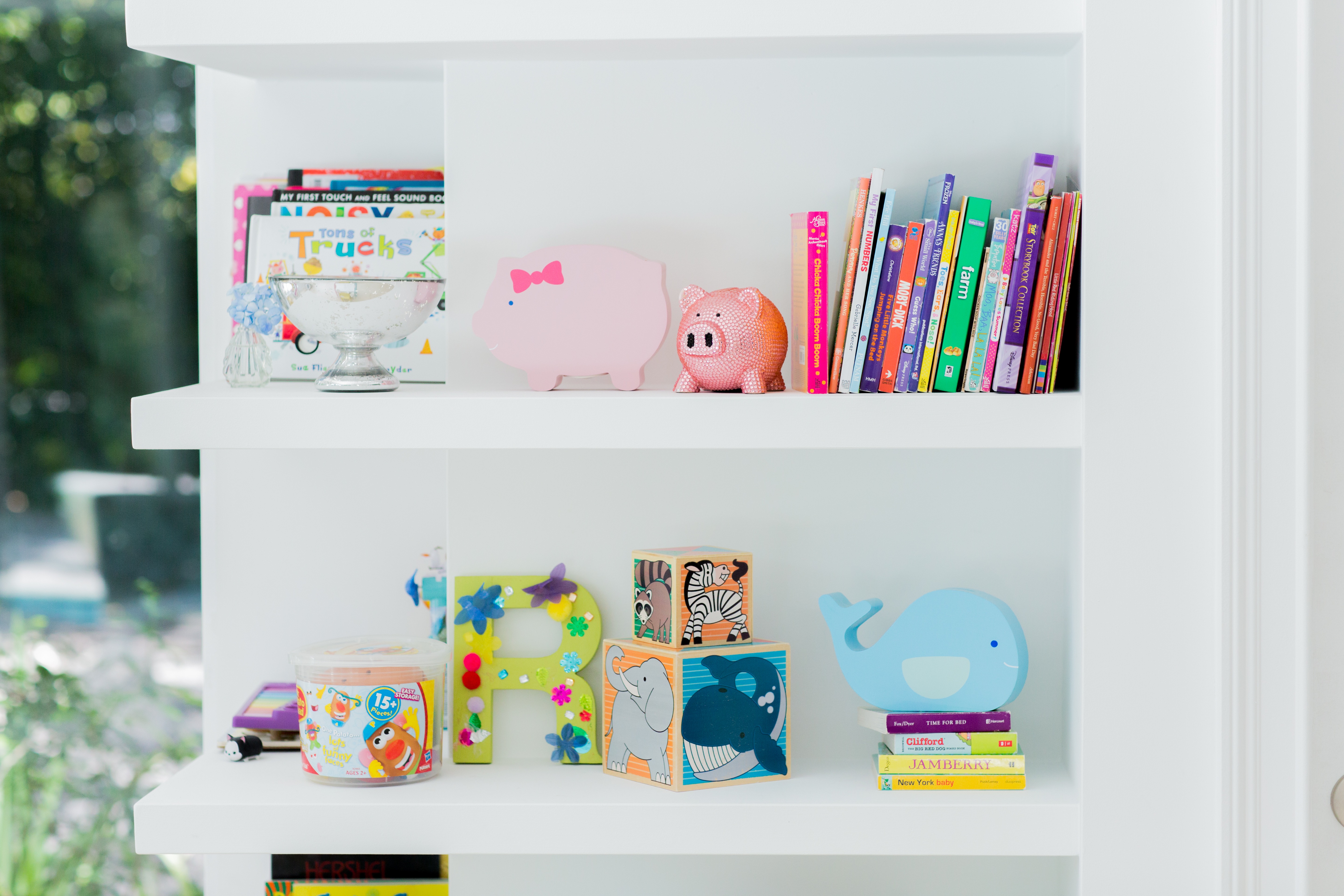
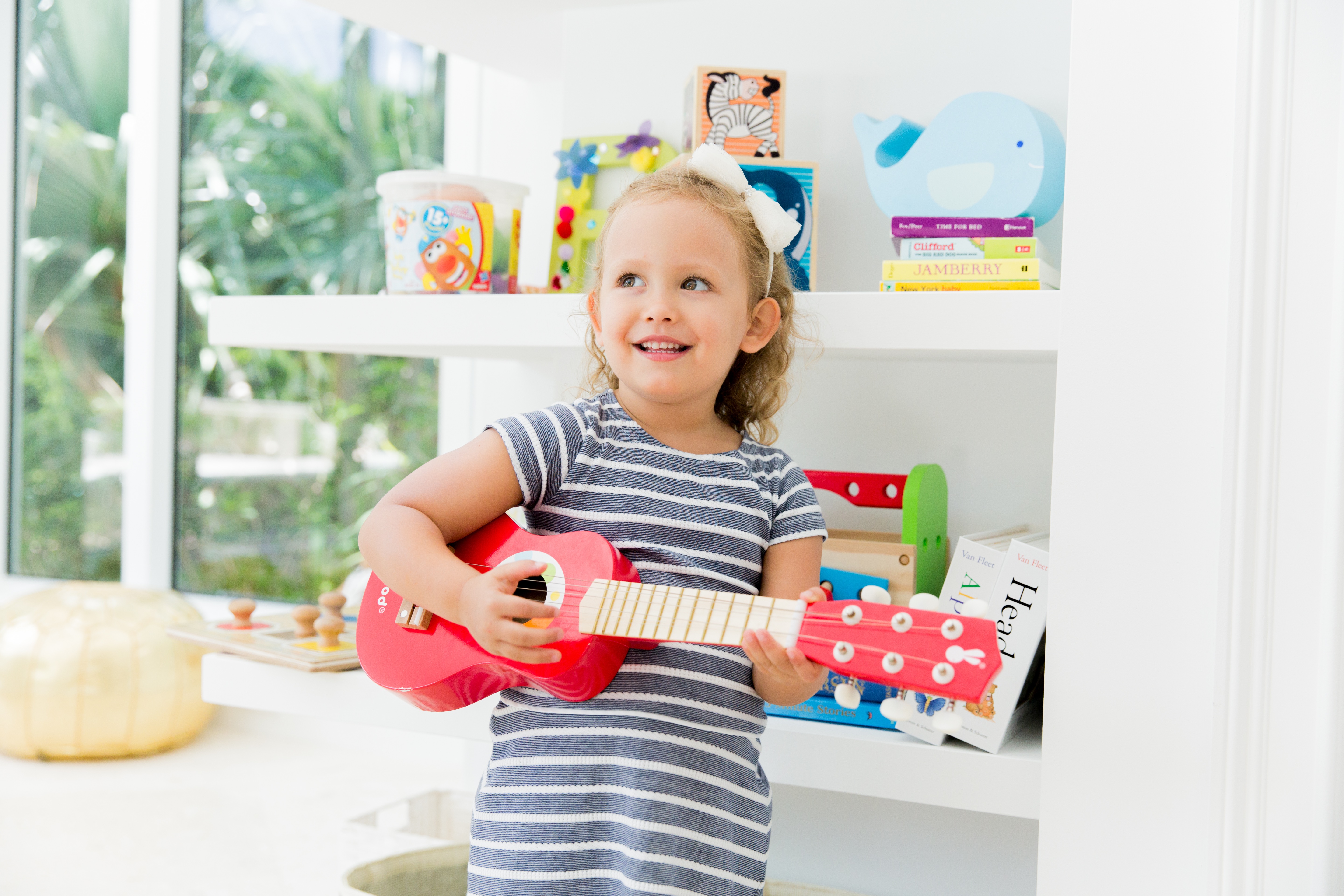
I wanted open shelving from a practicality standpoint as much as from a decor standpoint. My kids (Brooks, two years old and Reese, 3.5 years old) can only reach the lowest two shelves, so I filled them with books, puzzles and toys that they can independently choose when playing—no opening doors required! Then the top few shelves are for me—they include a mix of pictures, vases and decorative toys like piggy banks and blocks. As always, the design is clean and white, but it’s definitely kid-friendly.
How did your personal style influence your design choices?
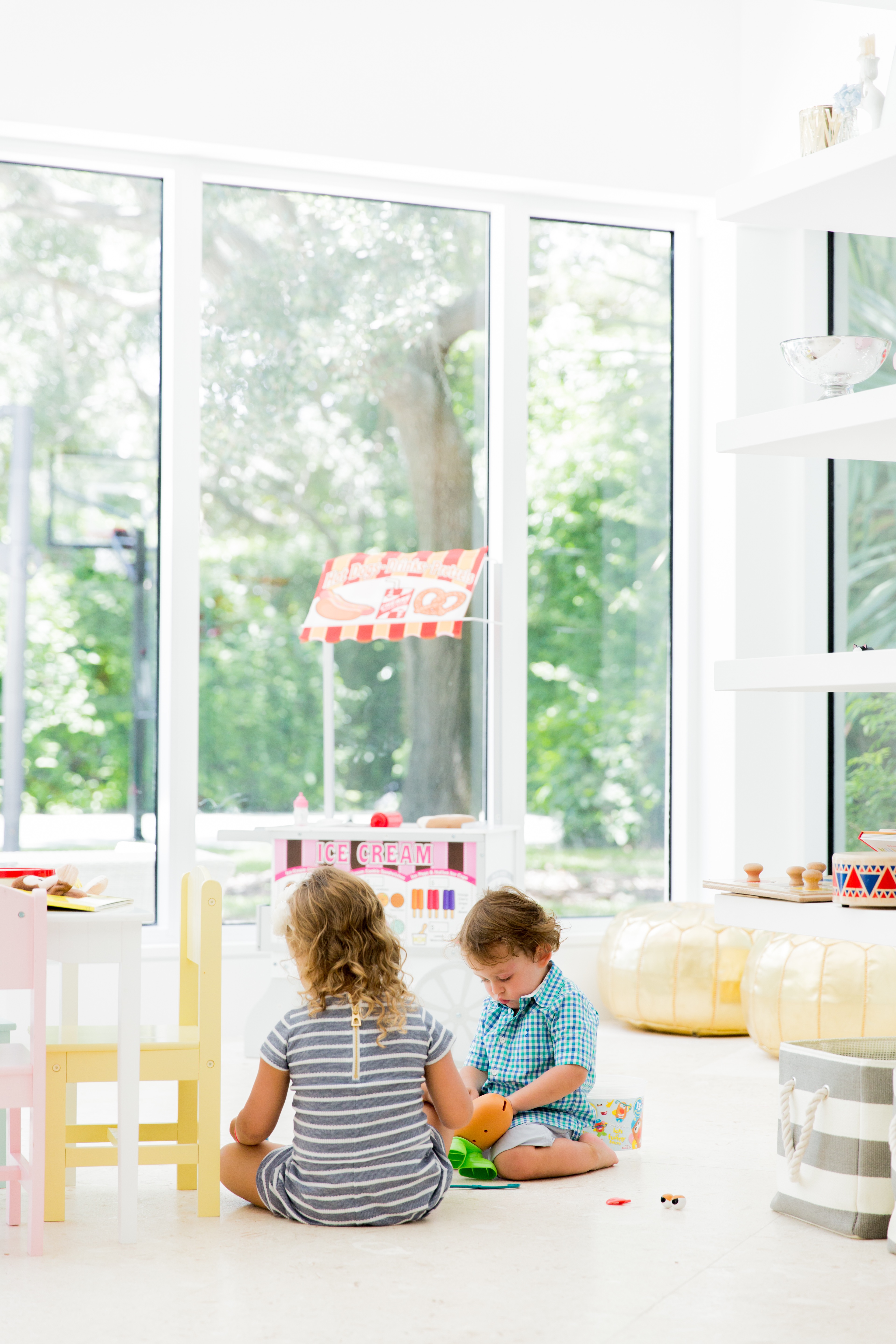
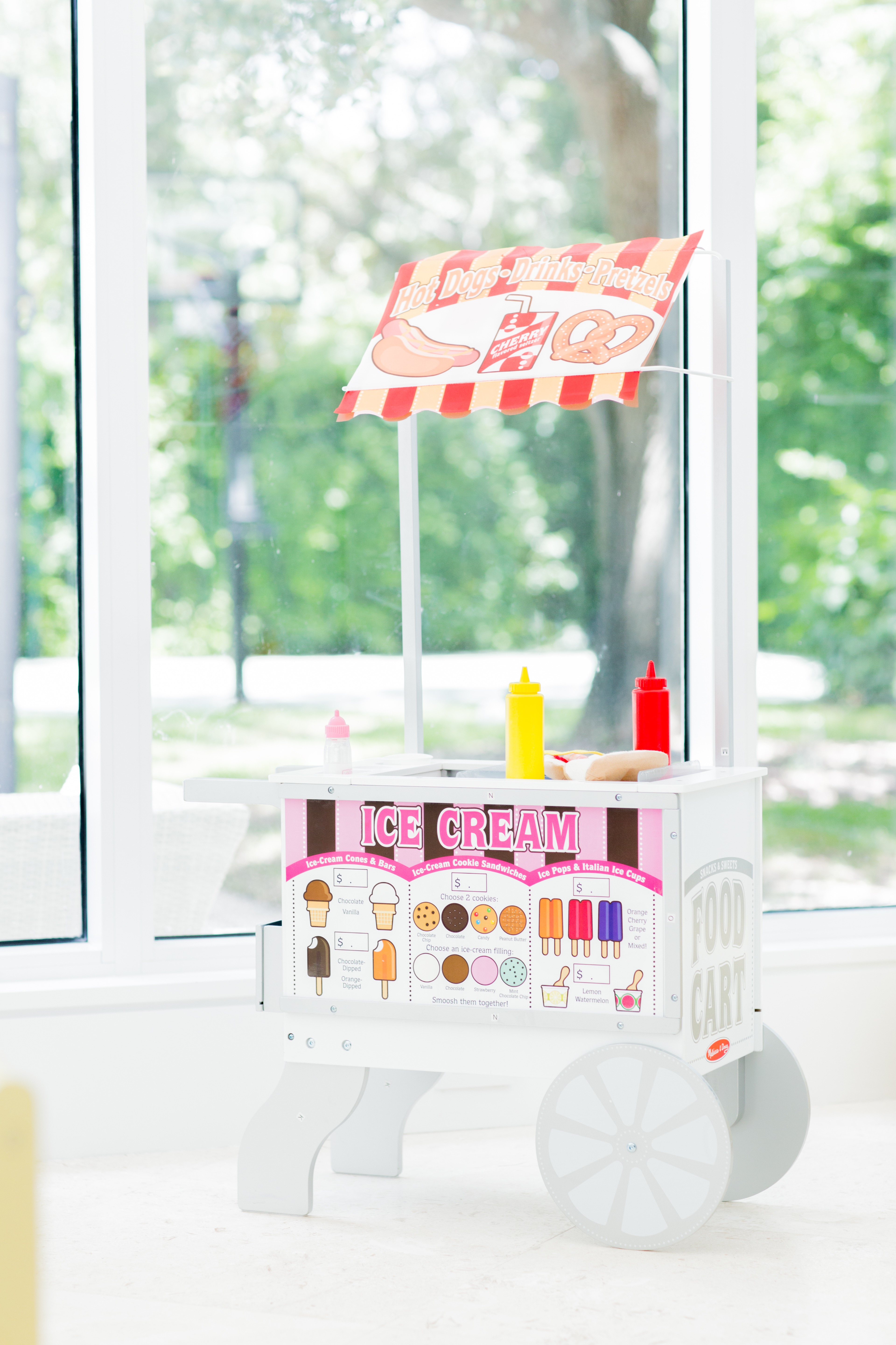
The white is like everything else in my life (anyone who knows my Instagram feed knows that well)—I love a clean palette. Then I figured if I was to have toys on display, I could at least make them trendy and retro, so I chose the fun wooden kitchen and hot dog stand over things that are plastic!

Did you have any unexpected obstacles when creating this room? How did you overcome them or spin them to your advantage?
This room is mainly windows except the one wall where I created shelving—it was that or a toy closet, but I felt like since I didn’t have wall space for photos or art, I had to make the toys a reflection of the room!

Now that the room is complete, what was your favorite part of the process? And what do you love the most about the finished design?
I love everything about this room. I love the open shelving. I love the natural light. I love that even when it’s in total disarray, it still doesn’t look too bad (and the bins make for easy clean-up). But most of all, I love that my kids LOVE the space.
Photography by Yesi of Simply Lively



Comments