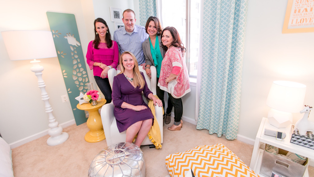
We were so excited to share the design reveal of Meghan’s embrace space, and now we want to give you a behind-the-scenes peek at how Pam and Melisa came up with the design.
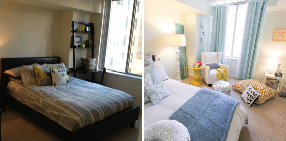
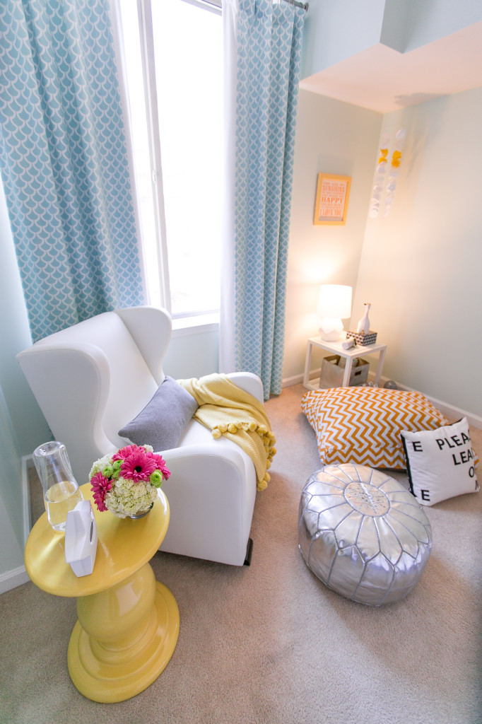
Since they were starting with a basic beige guest room, Pam and Melisa knew they wanted to transform it into a bright and airy space with a gender-neutral color scheme. The focal point of the room was a large window just begging for custom drapes, and it was the perfect spot to showcase a beautiful white glider in which Meghan and her baby will spend many hours bonding. Sprinkling the design with personal touches—like the dog bed, personal photographs and sentimental art—made the space special for parents Meghan and Brad.
Here is a before and after shot of the guest room-to-nursery transformation.
Check out our inspiration for the room in the design board below.
Mariposa Floor Lamp, Ceramic Nara Yellow Side Table, Bedside Carafe, Vola Glider, Silver Gibraltar Pouf, Giraffe Growth Chart, Round Baskets, Blue Mohair Throw Blanket, Aqua Bird Pillow, Spruce Tree Bookcase, Aqua Mini Parquet Fabric, White and Yellow Mobile, Flokati Wool Rug, Sleepi Crib, Muslin Swaddle Blanket, JBL Flip Portable Bluetooth Stereo Speaker, iPod Nano, Between a Rock and a Lamp, Ditto White Cube Shelf, Metallic Storage Bin




Comments
Plum Pretty Sugar
Such beauty! Thank you for sharing!
xo
http://www.PlumPrettySugar.blogspot.com
Ginger
Great job guys! It is indeed neutral and gloomy to bright and airy!
PN_Melisa
Our pleasure! It was a really fun project for a lovely young couple!
PN_Melisa
Amazing what a little color can do. Thanks Ginger!
Freya Natasha Fernandez Dy
I love that giraffe stencil growth chart! It’s really what caught my eye.
Paper Plane
I loved it! So fresh and airy.
http://www.thepaperplaneshop.etsy.com